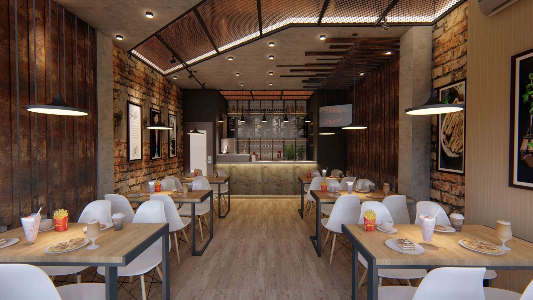

Have you ever felt why you feel so energized after stepping foot into a vivid red room or so tranquil when in a beautifully neutral living space? It’s likely because of color psychology in interior design, connecting color to our emotions.
Different shades conjure various emotions so when debating on which hues to choose for your home it’s key to think about the kind of atmosphere you want to create and which colors will help you achieve this.
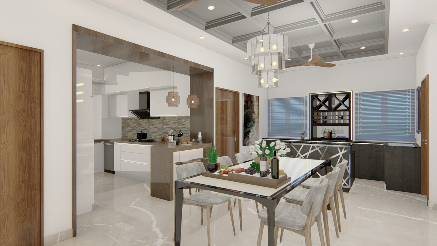
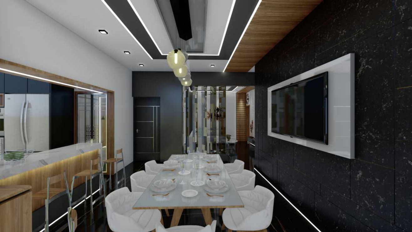
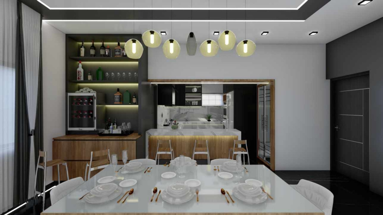
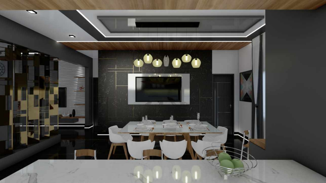
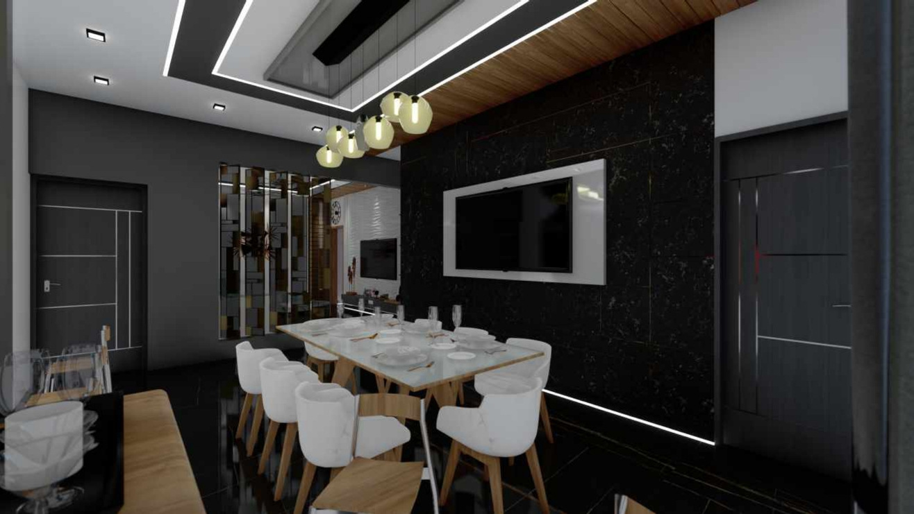
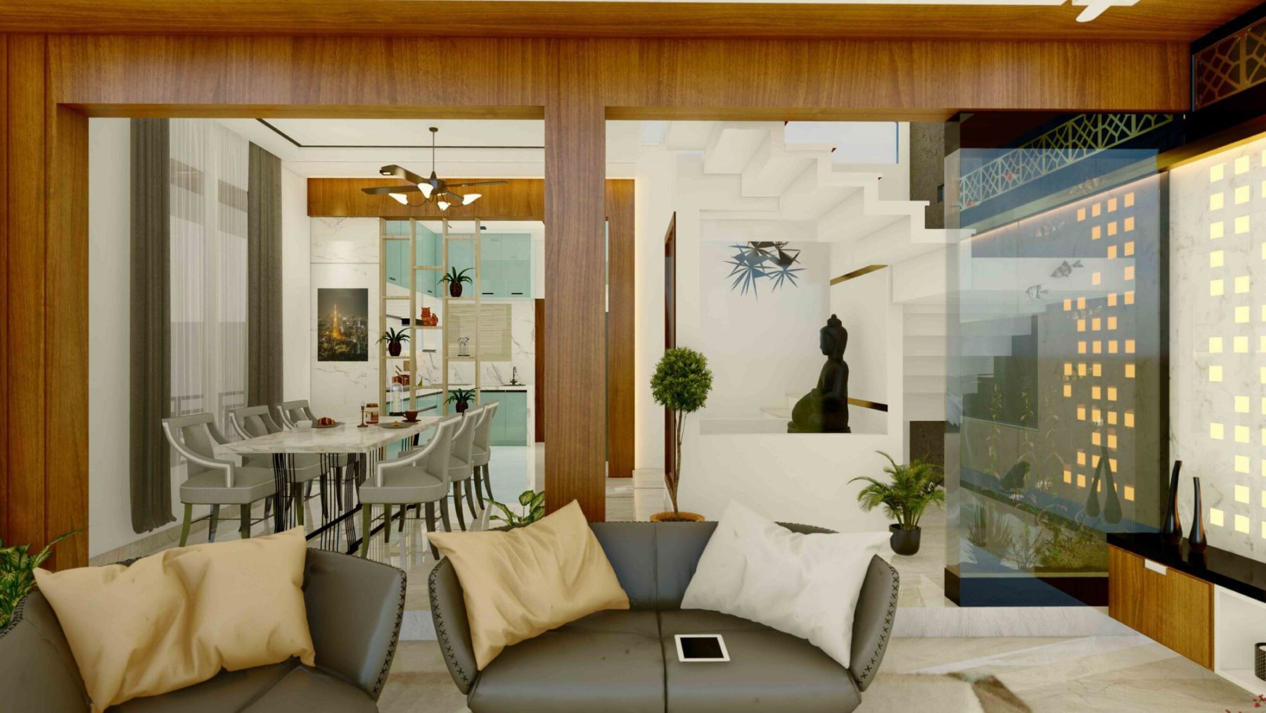
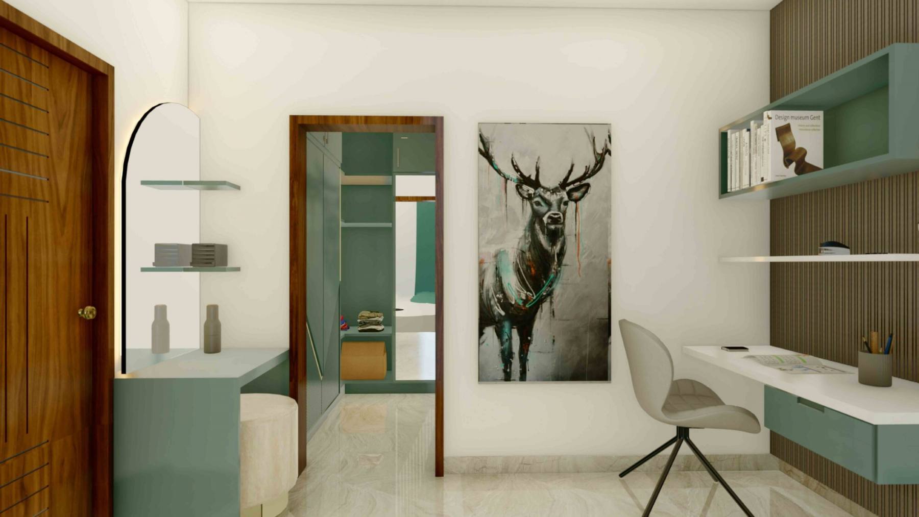
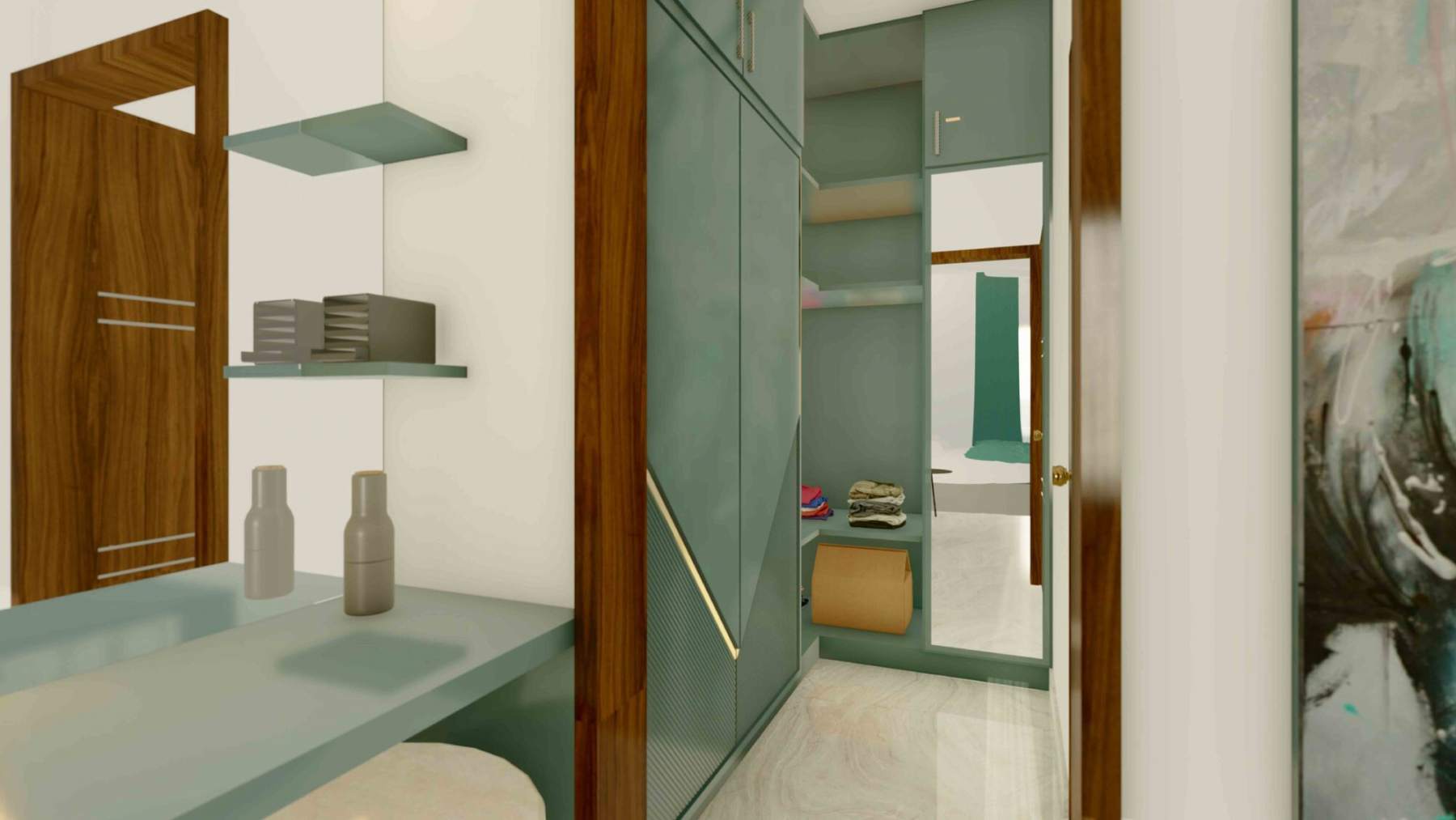
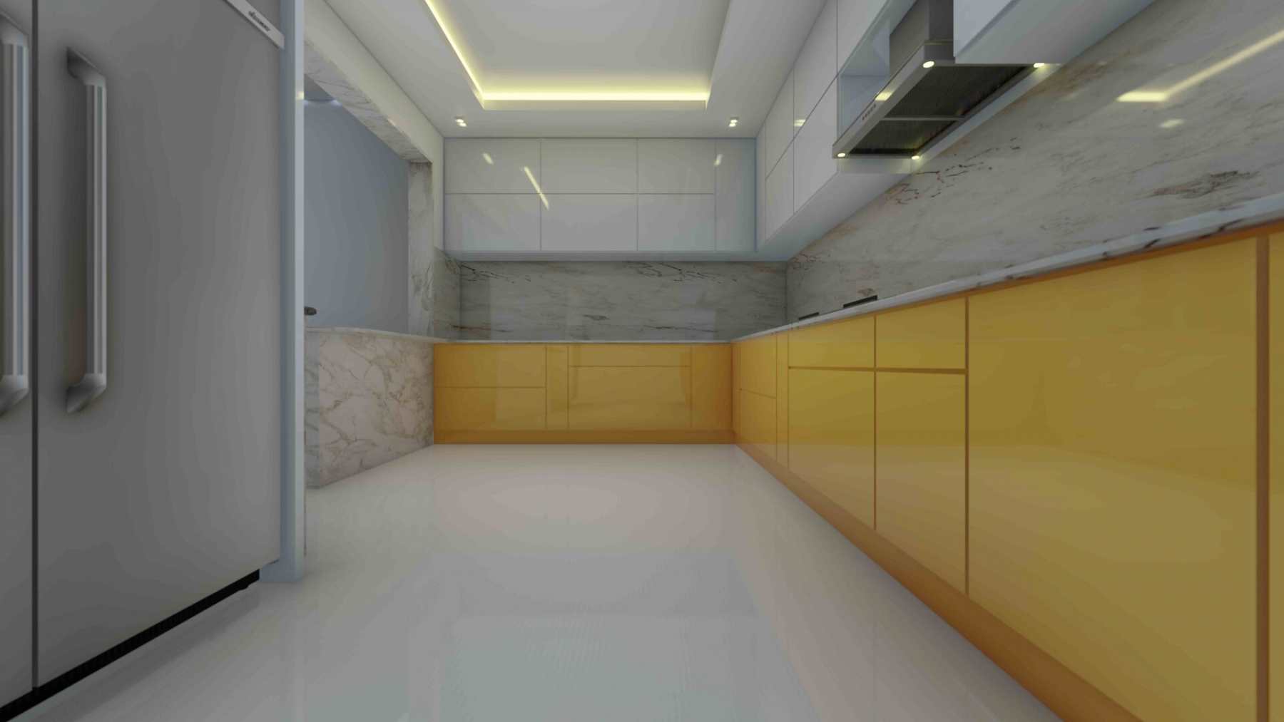
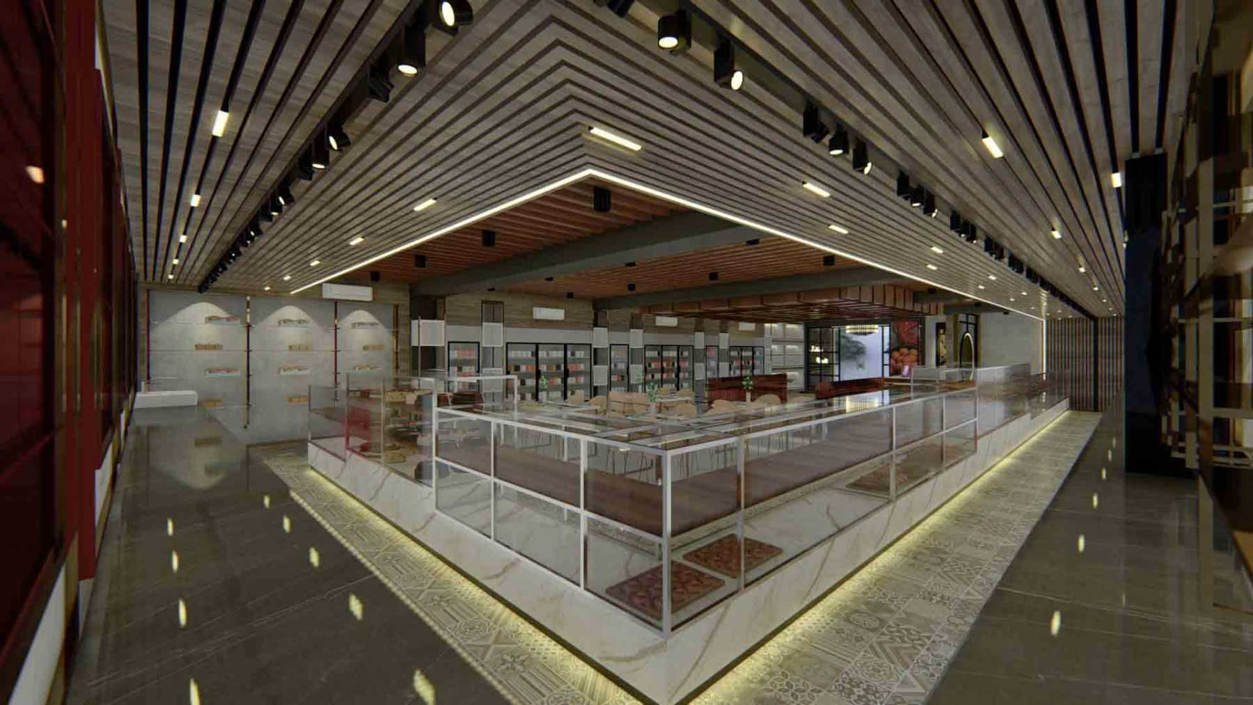
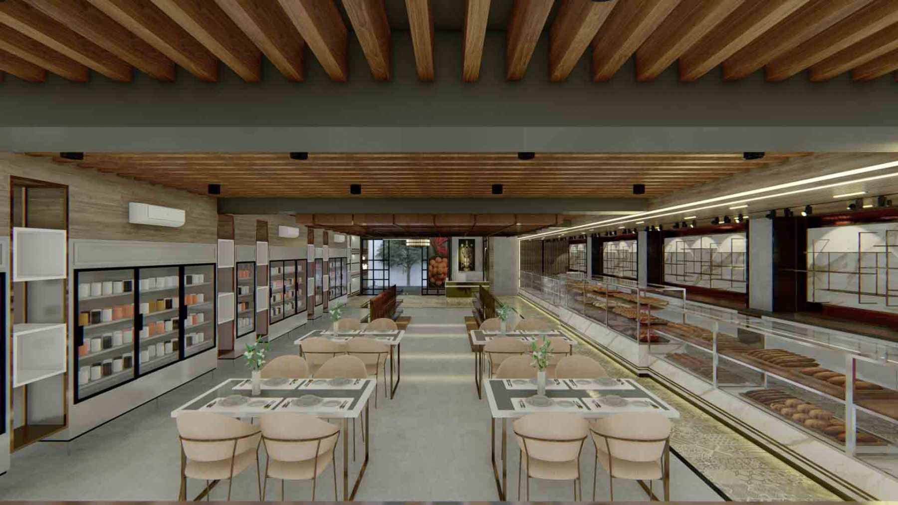
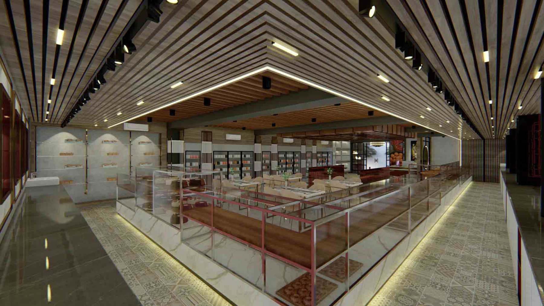
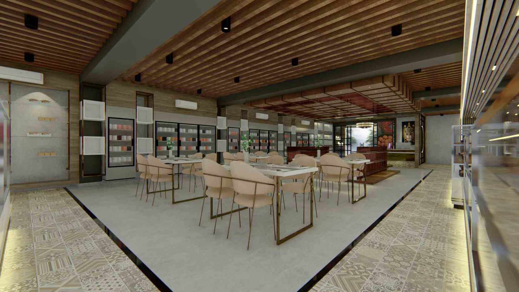
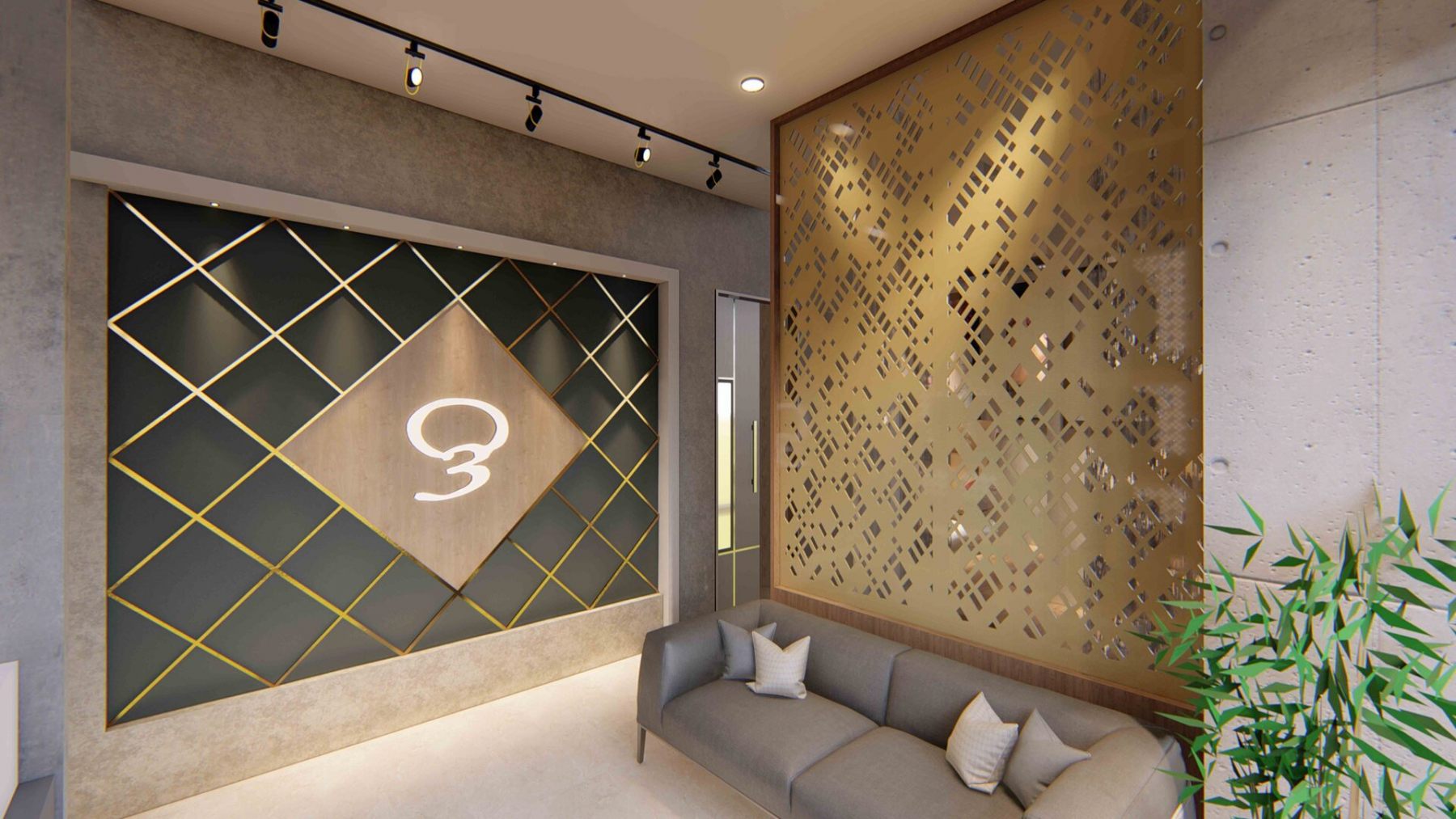
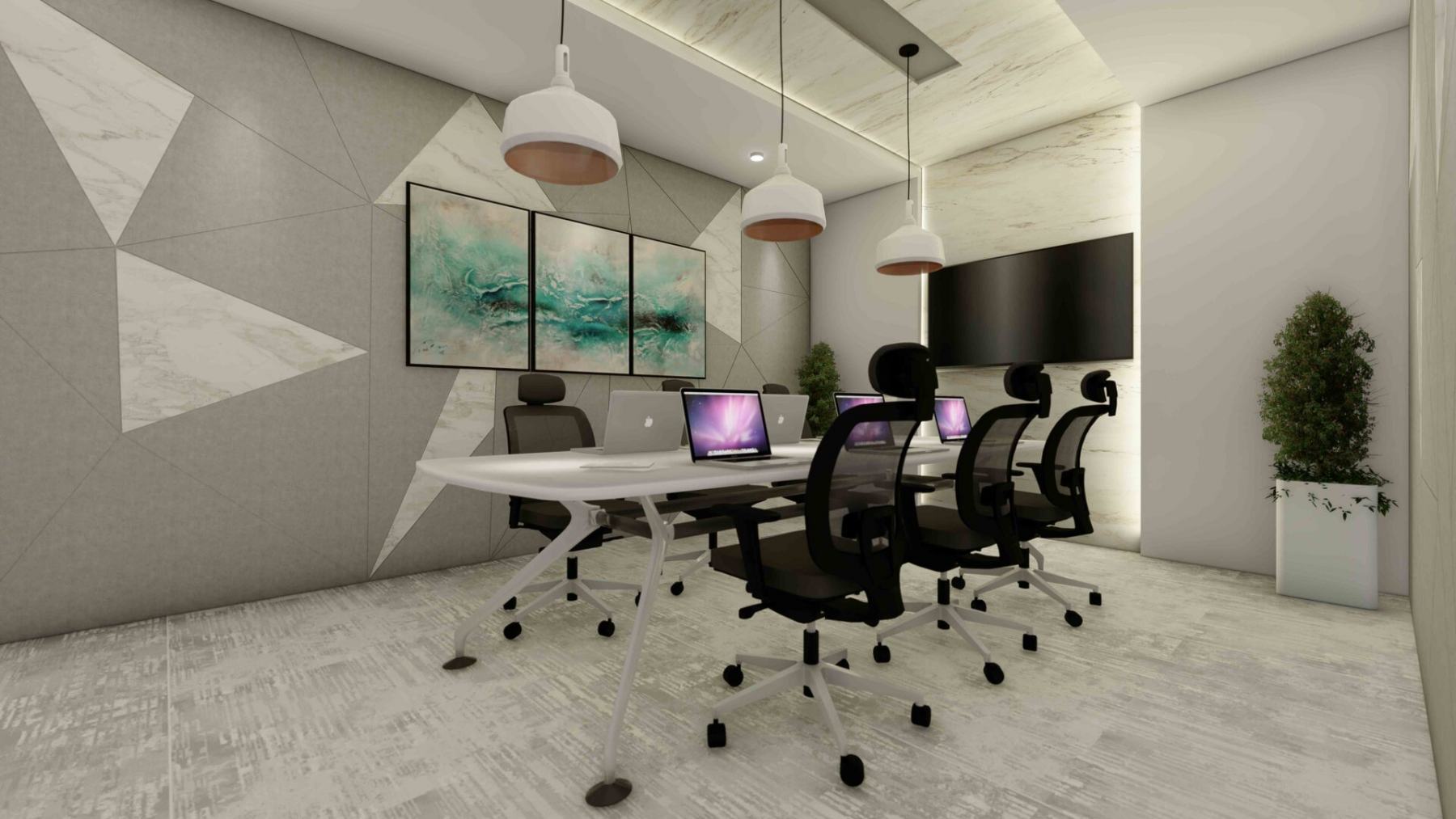
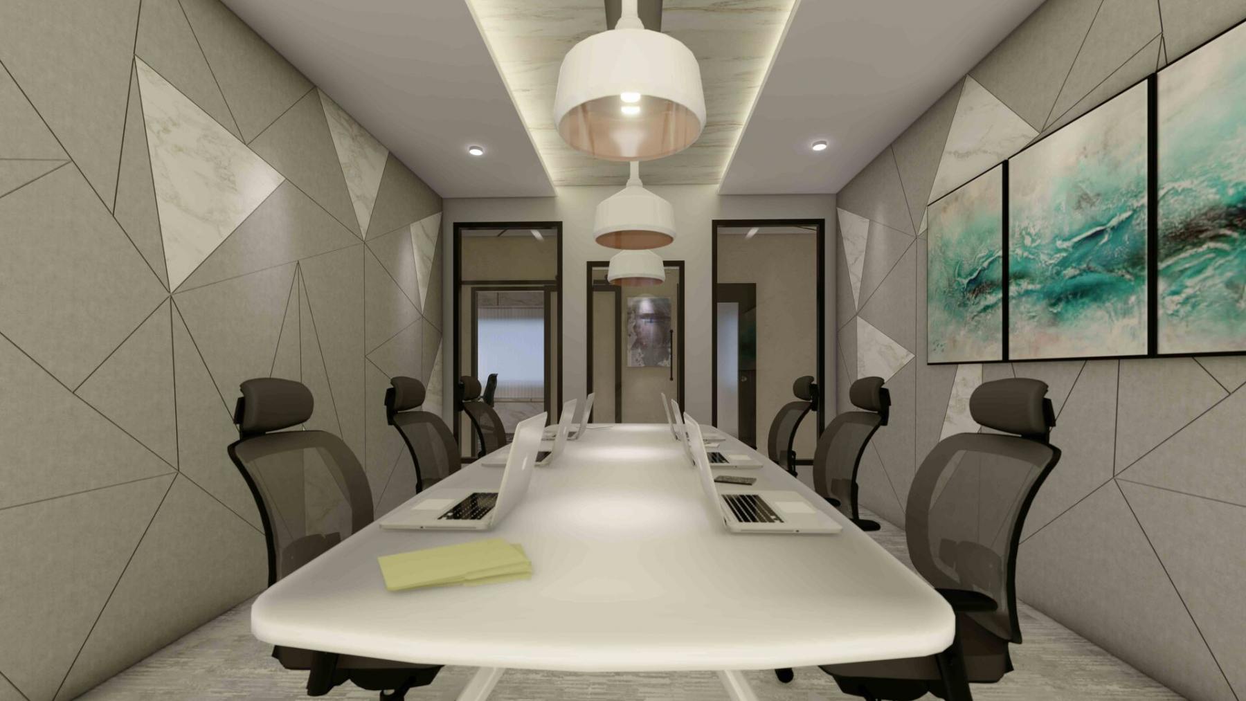
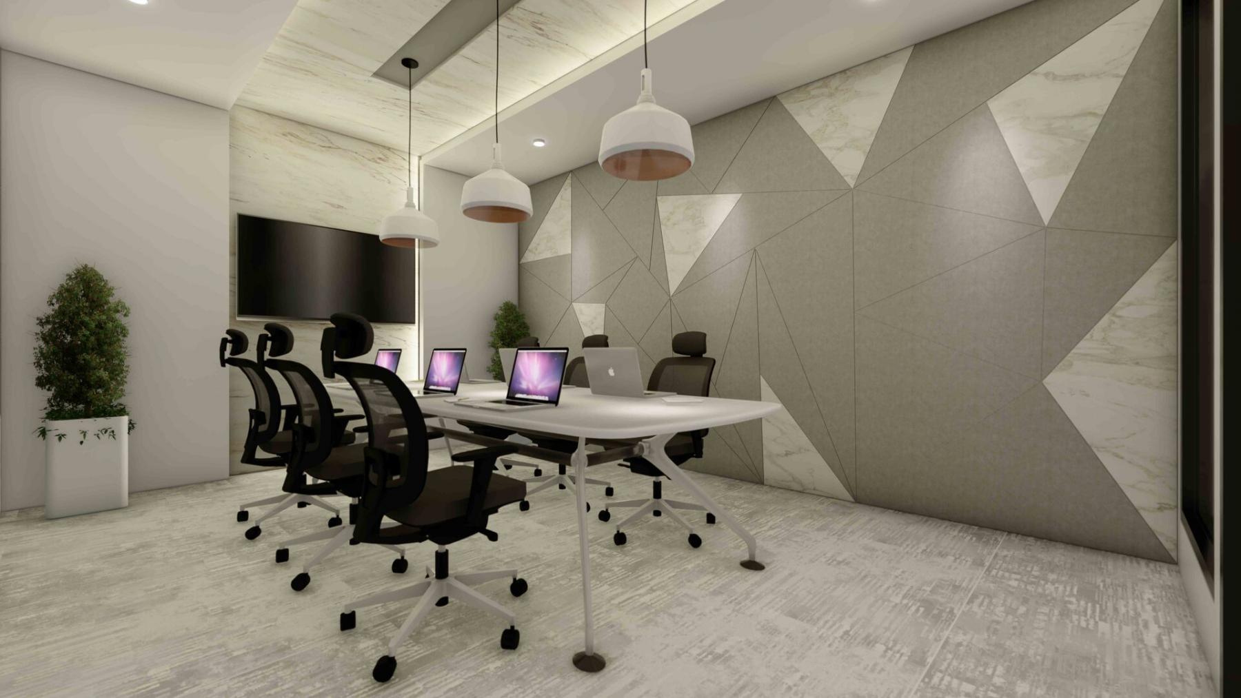
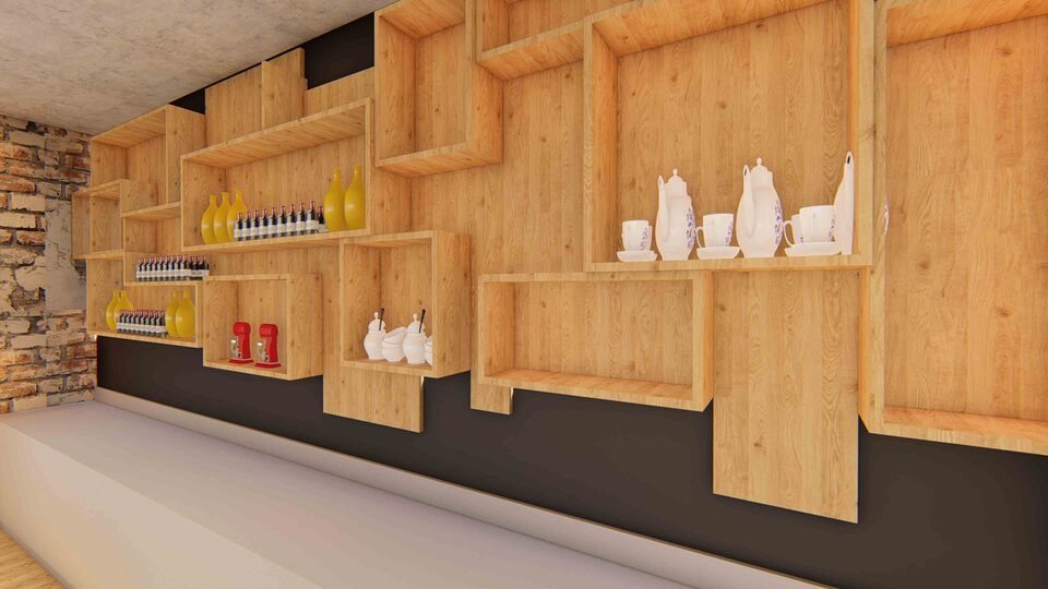
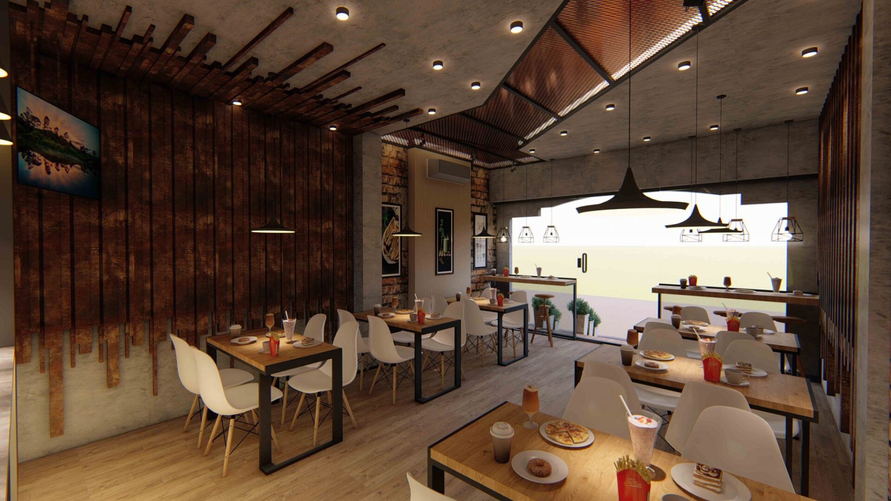
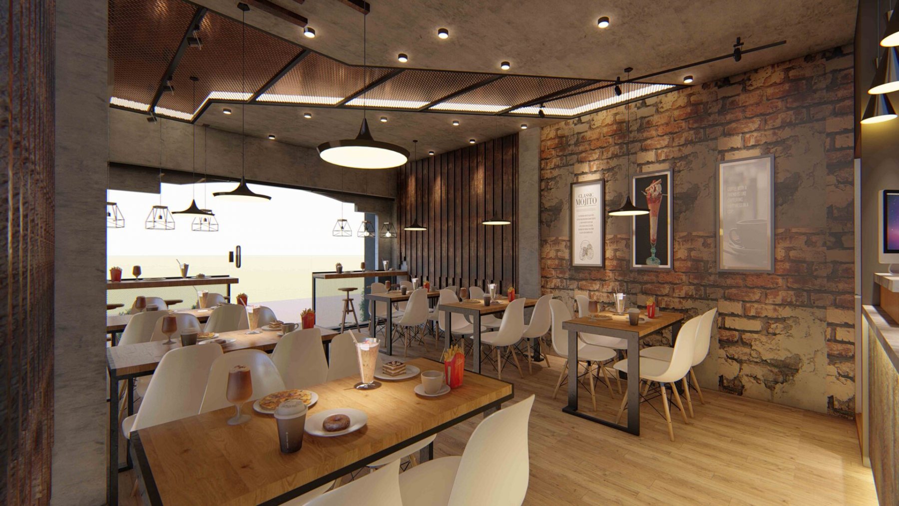
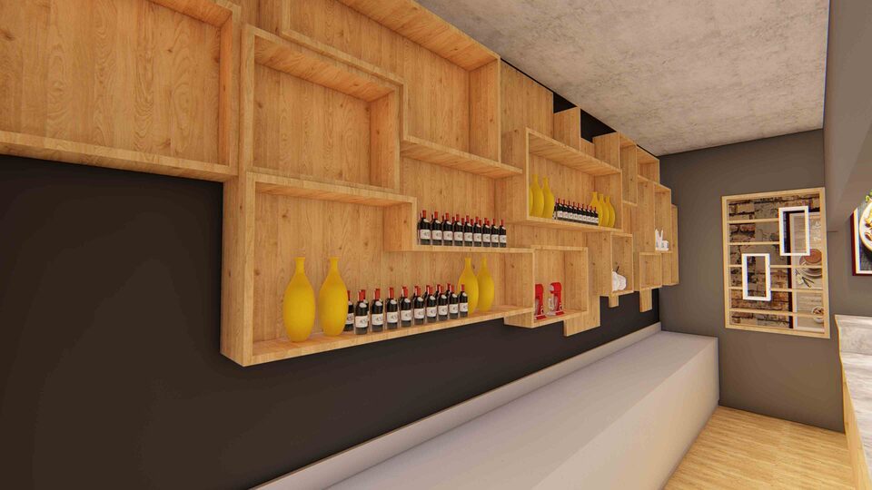
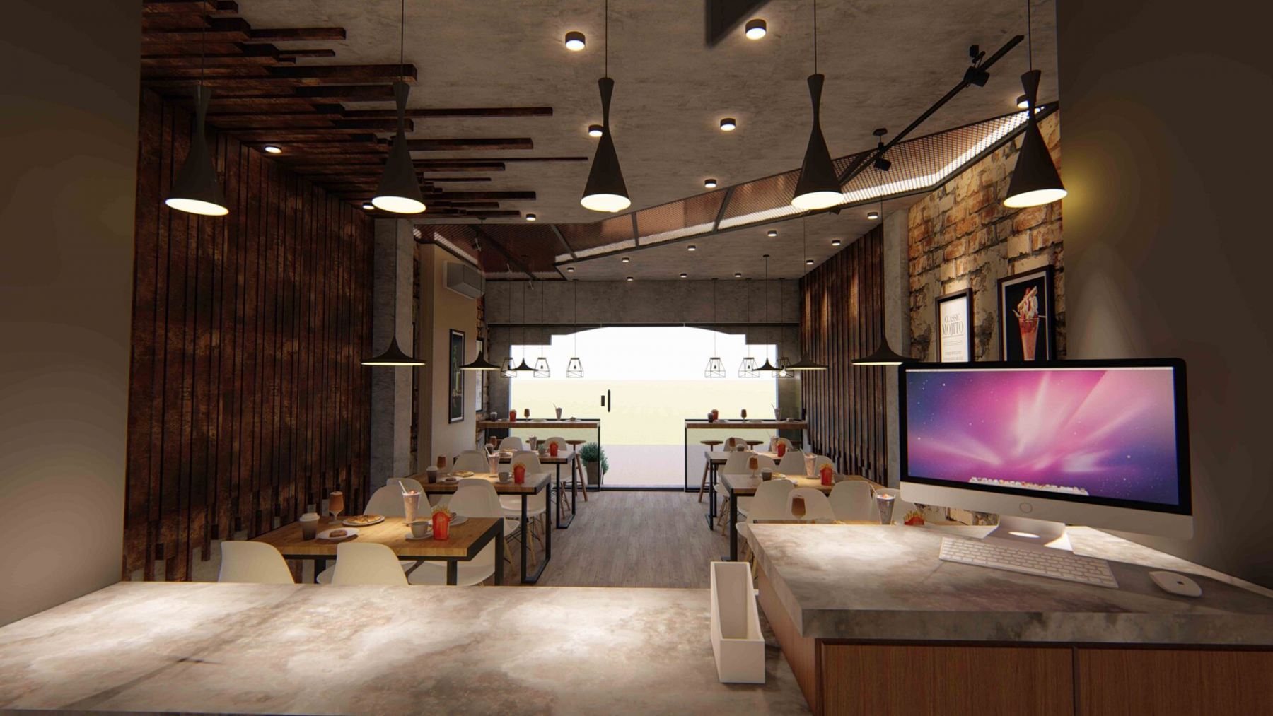
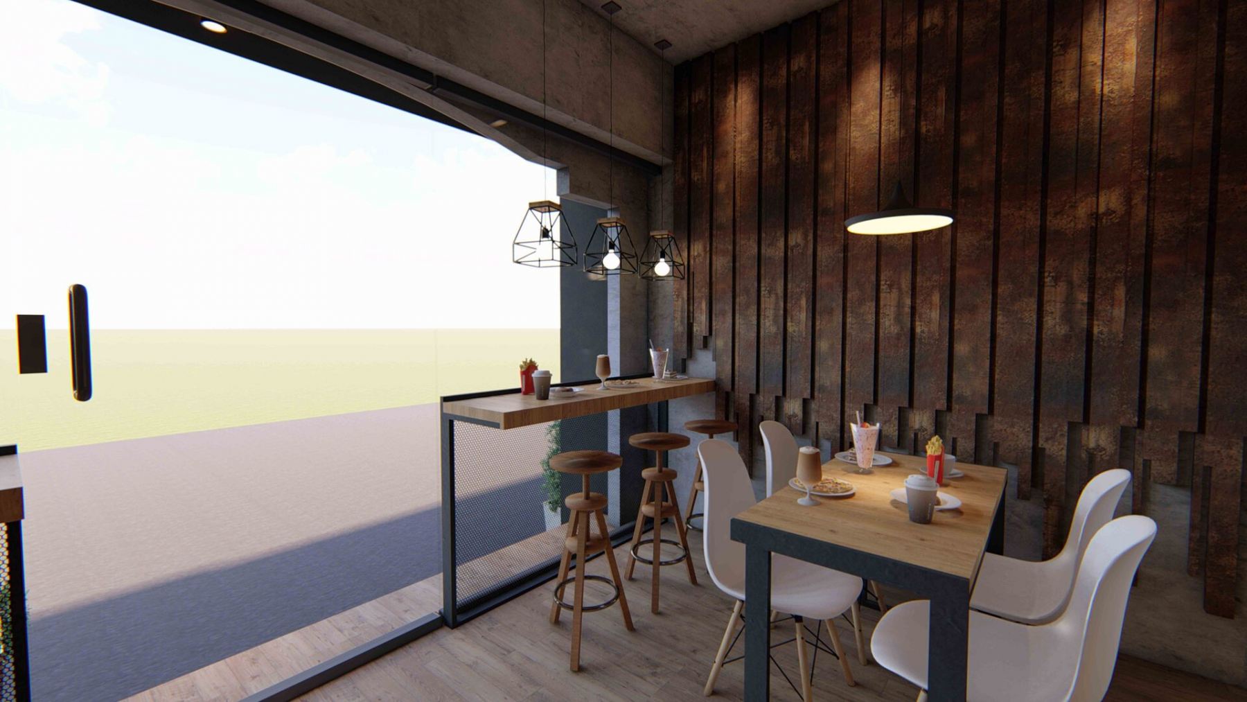
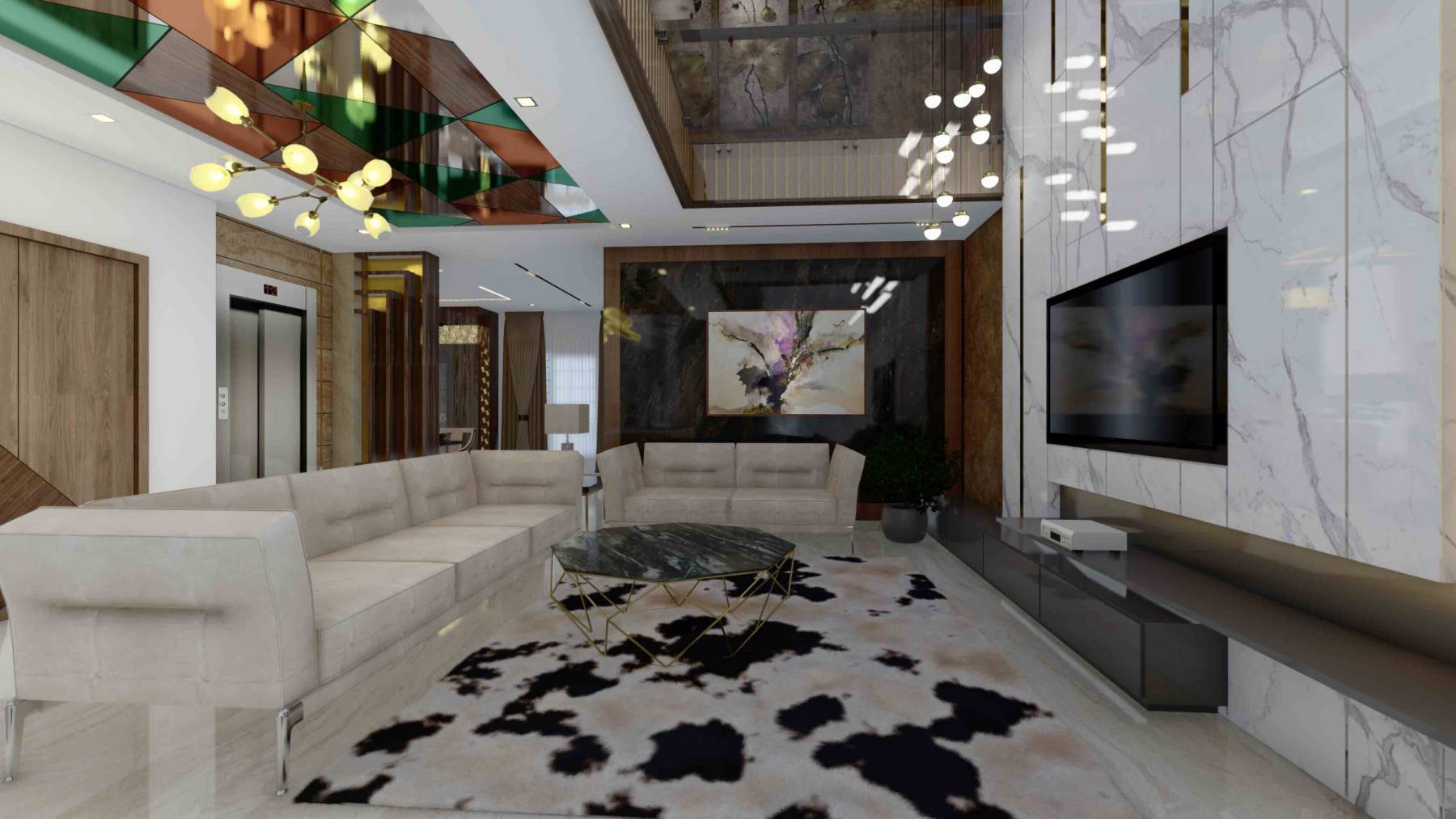
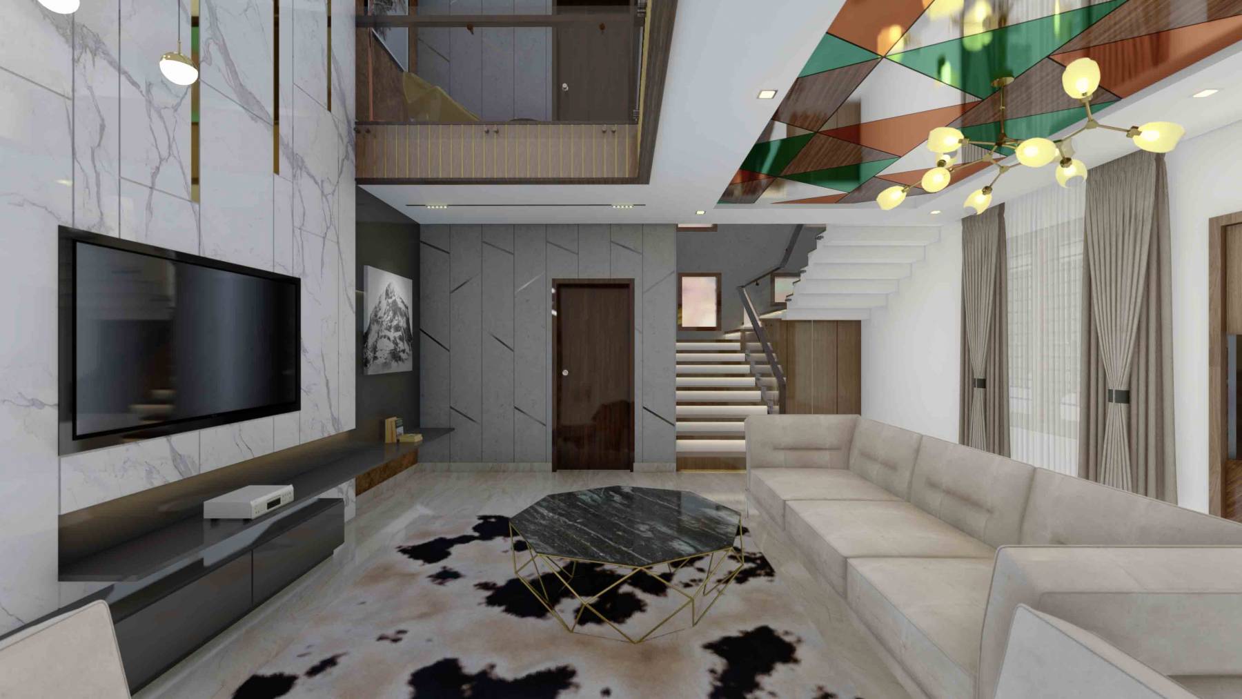
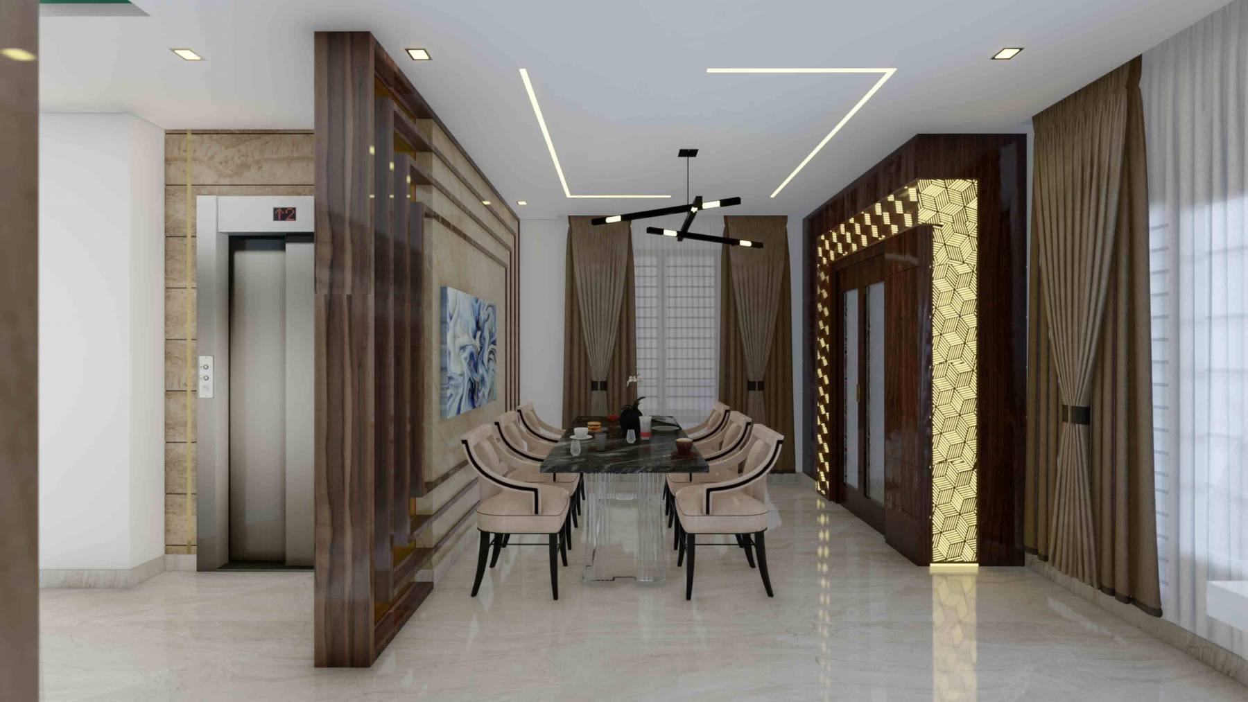
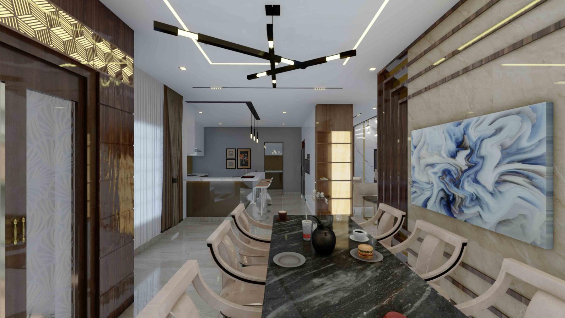
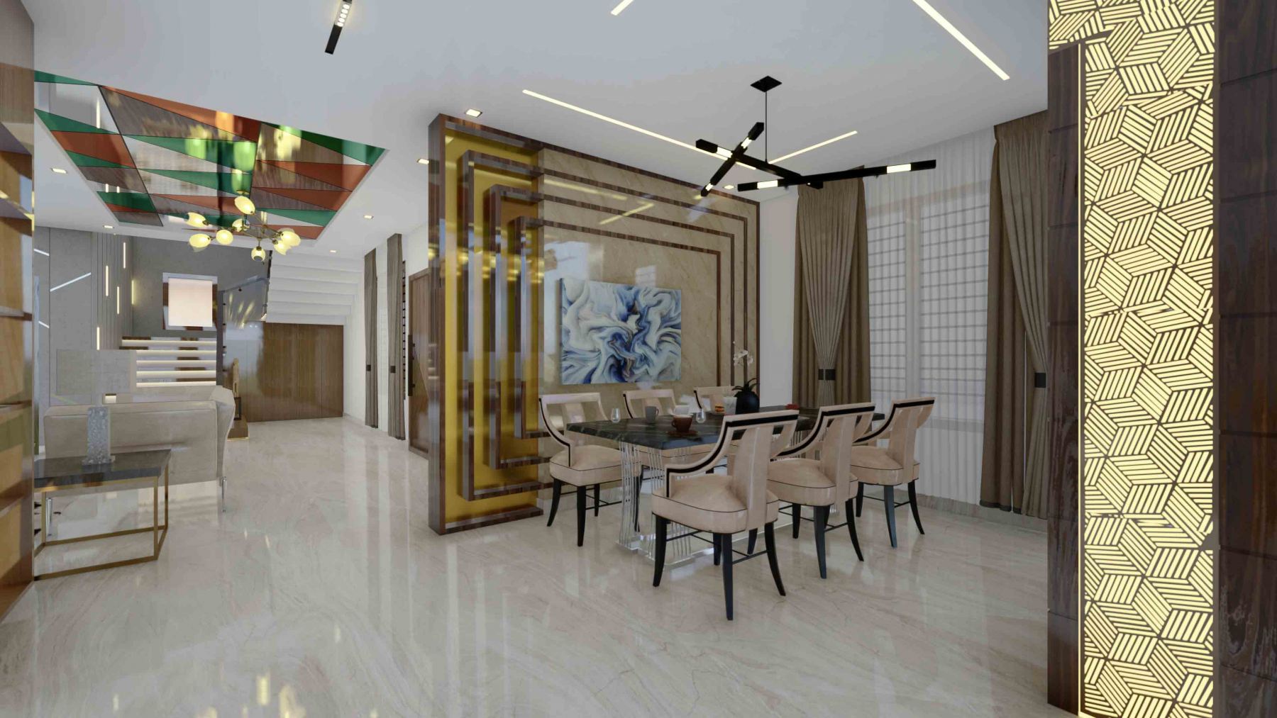
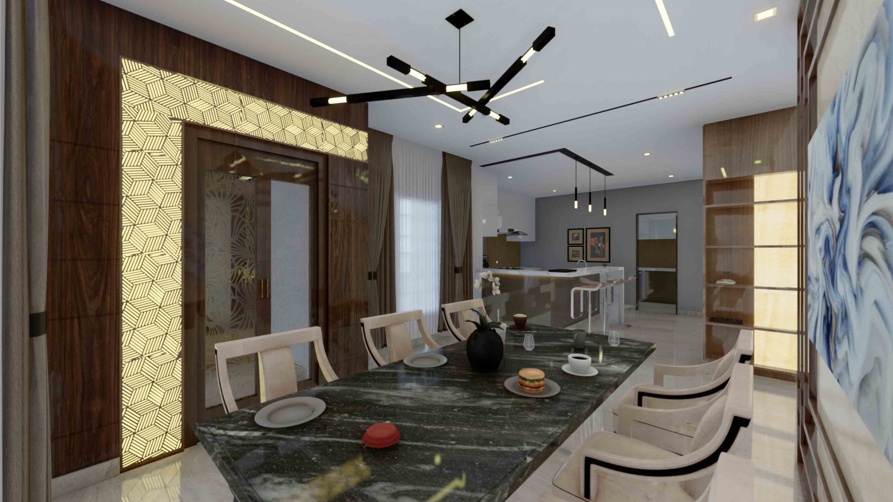
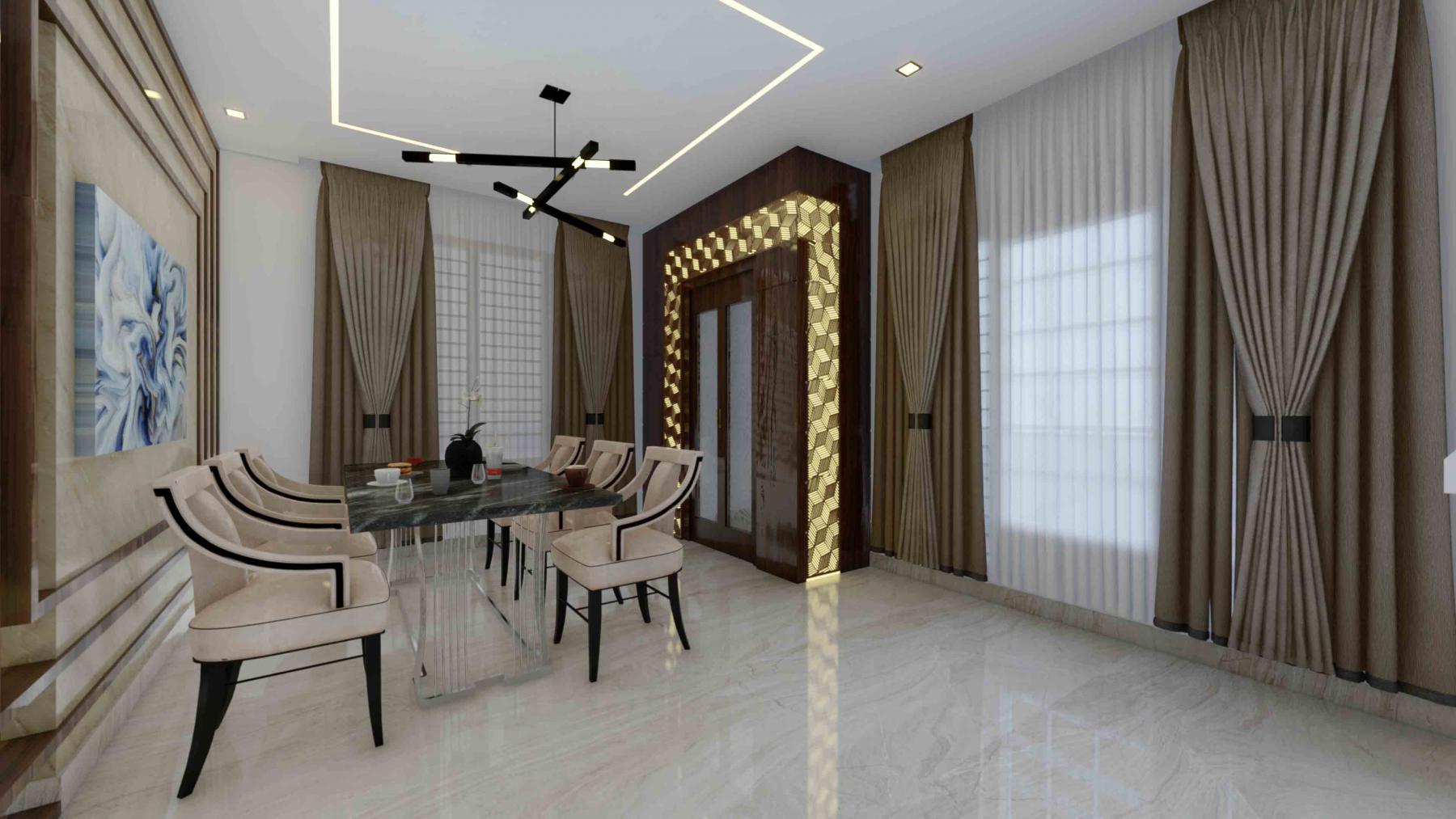
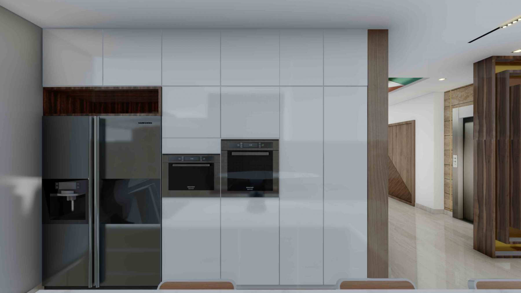
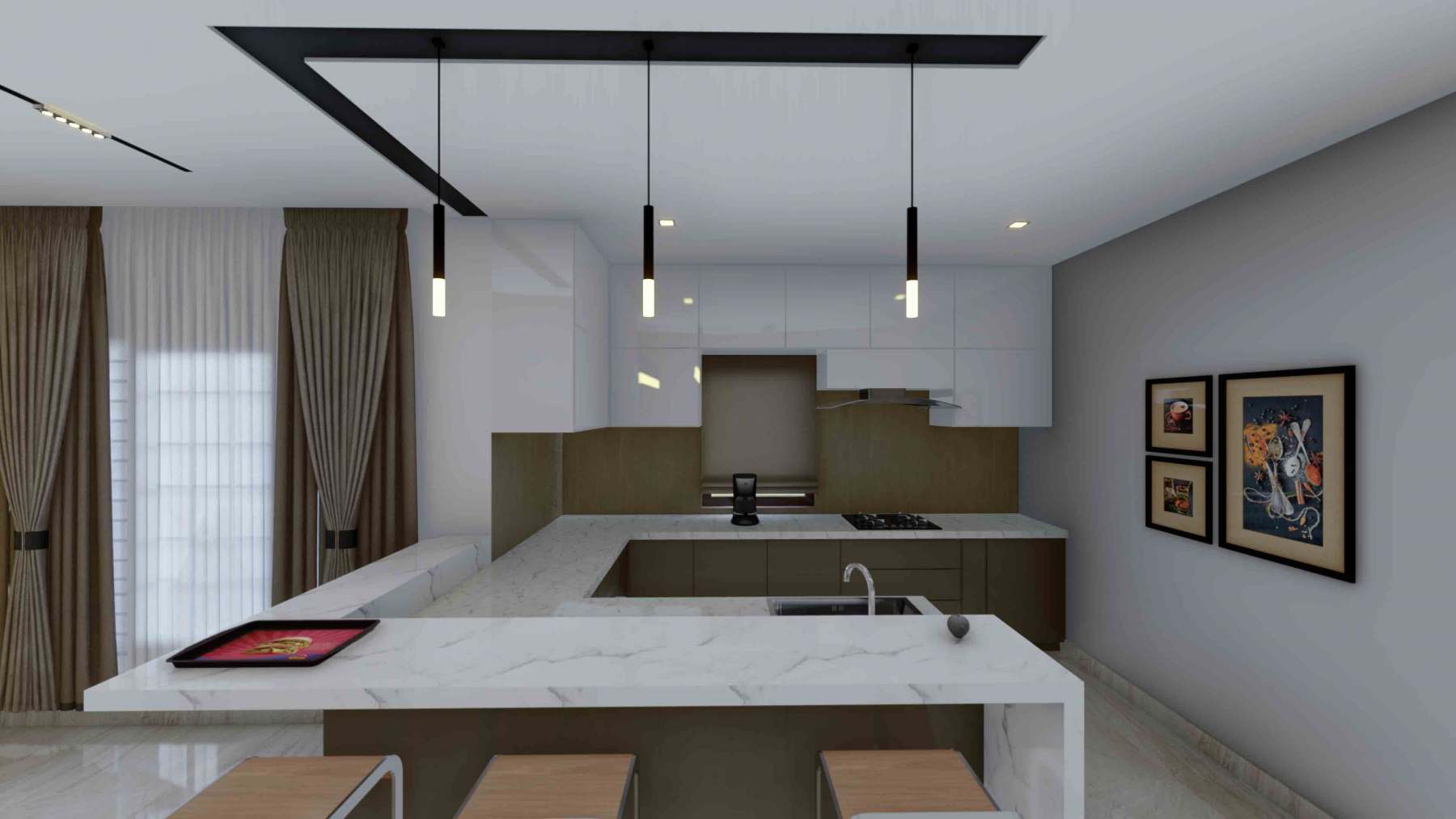
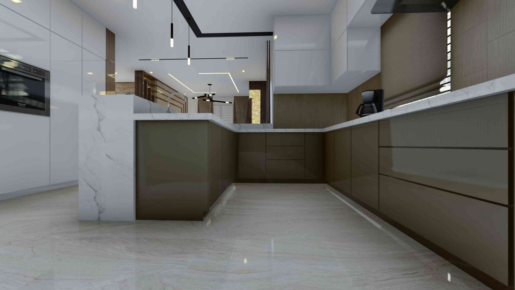
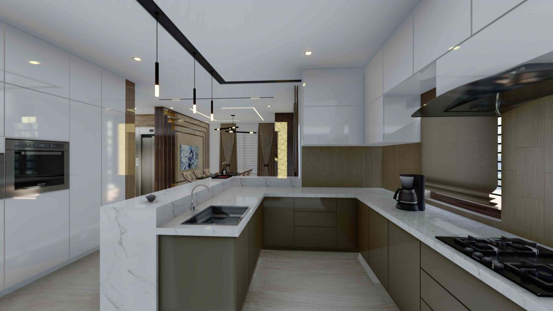
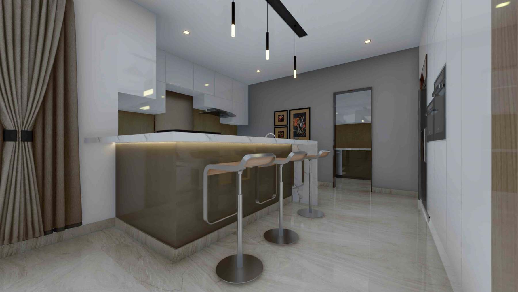
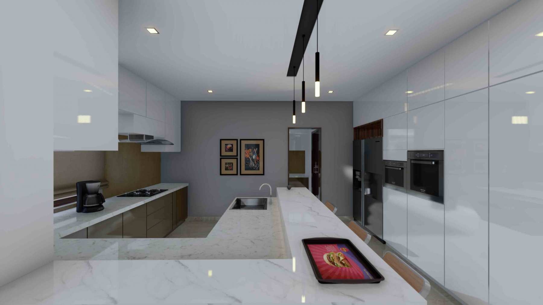
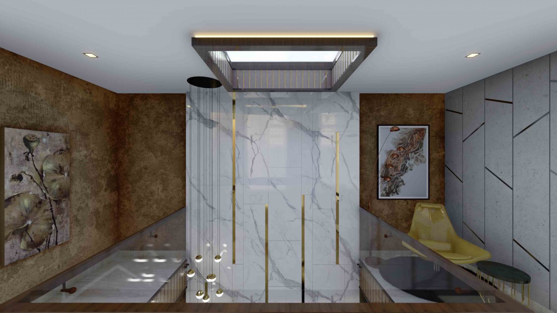
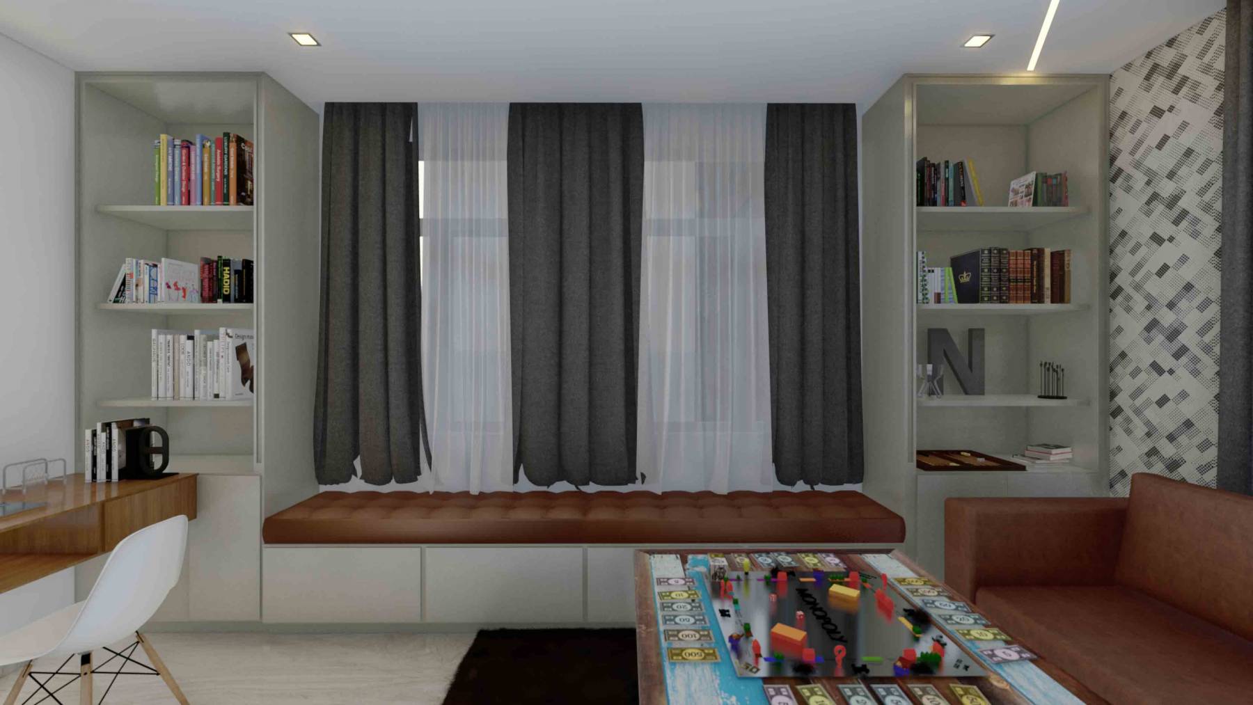
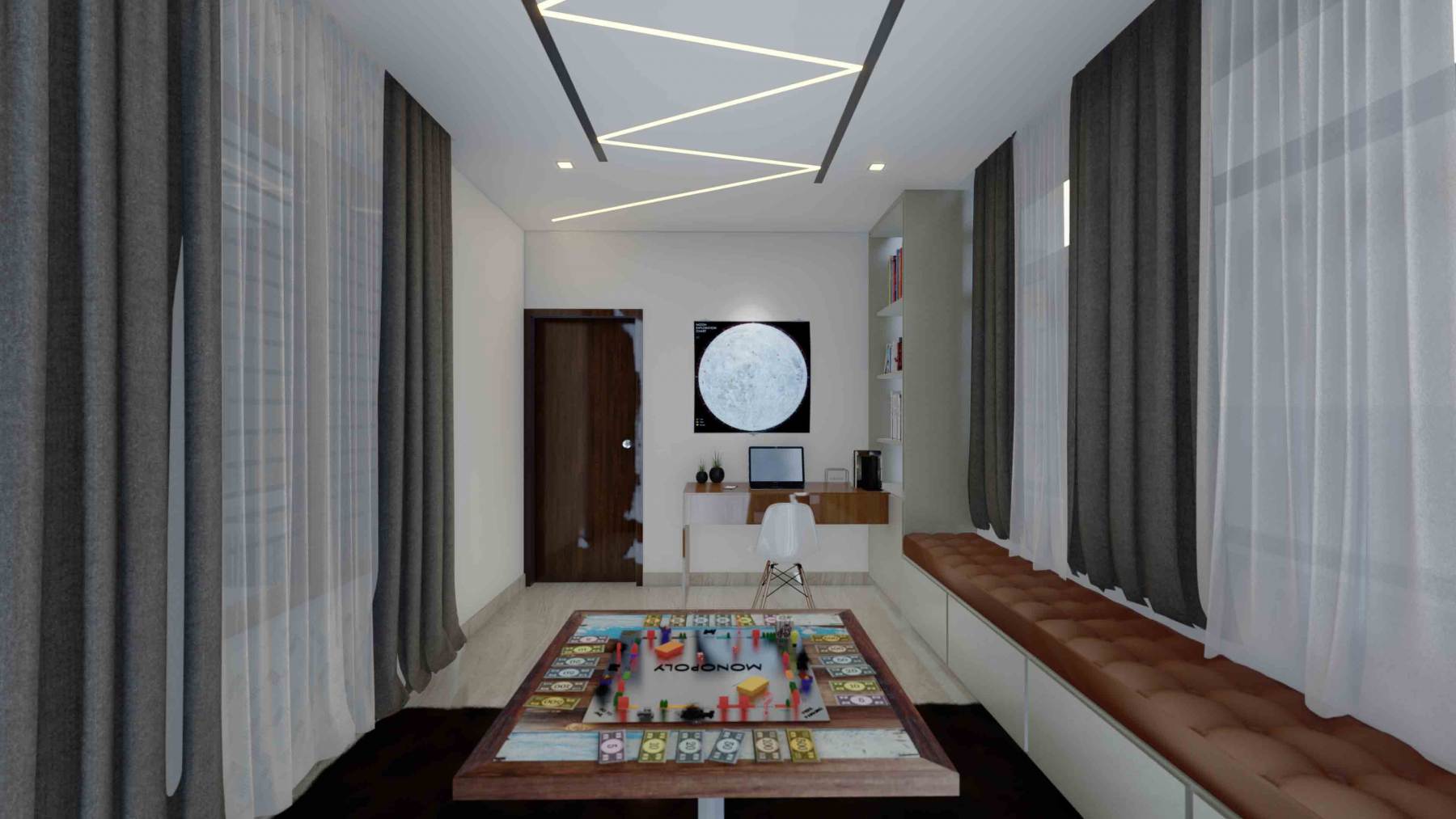
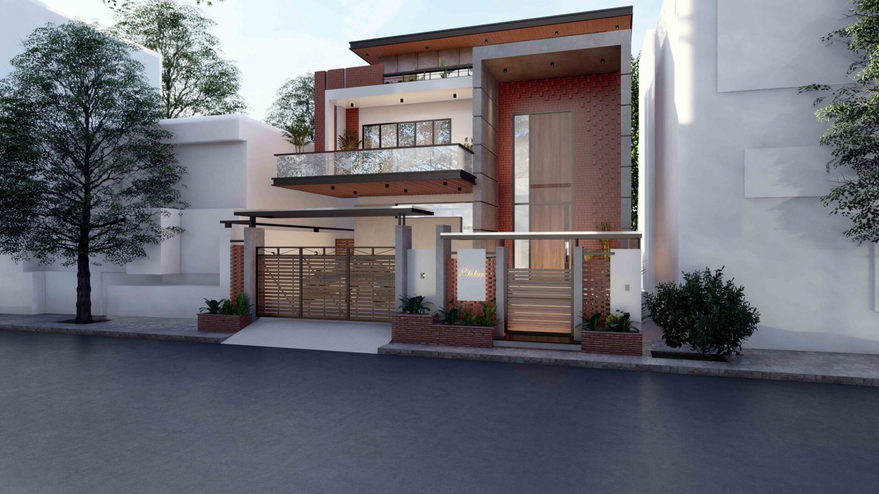
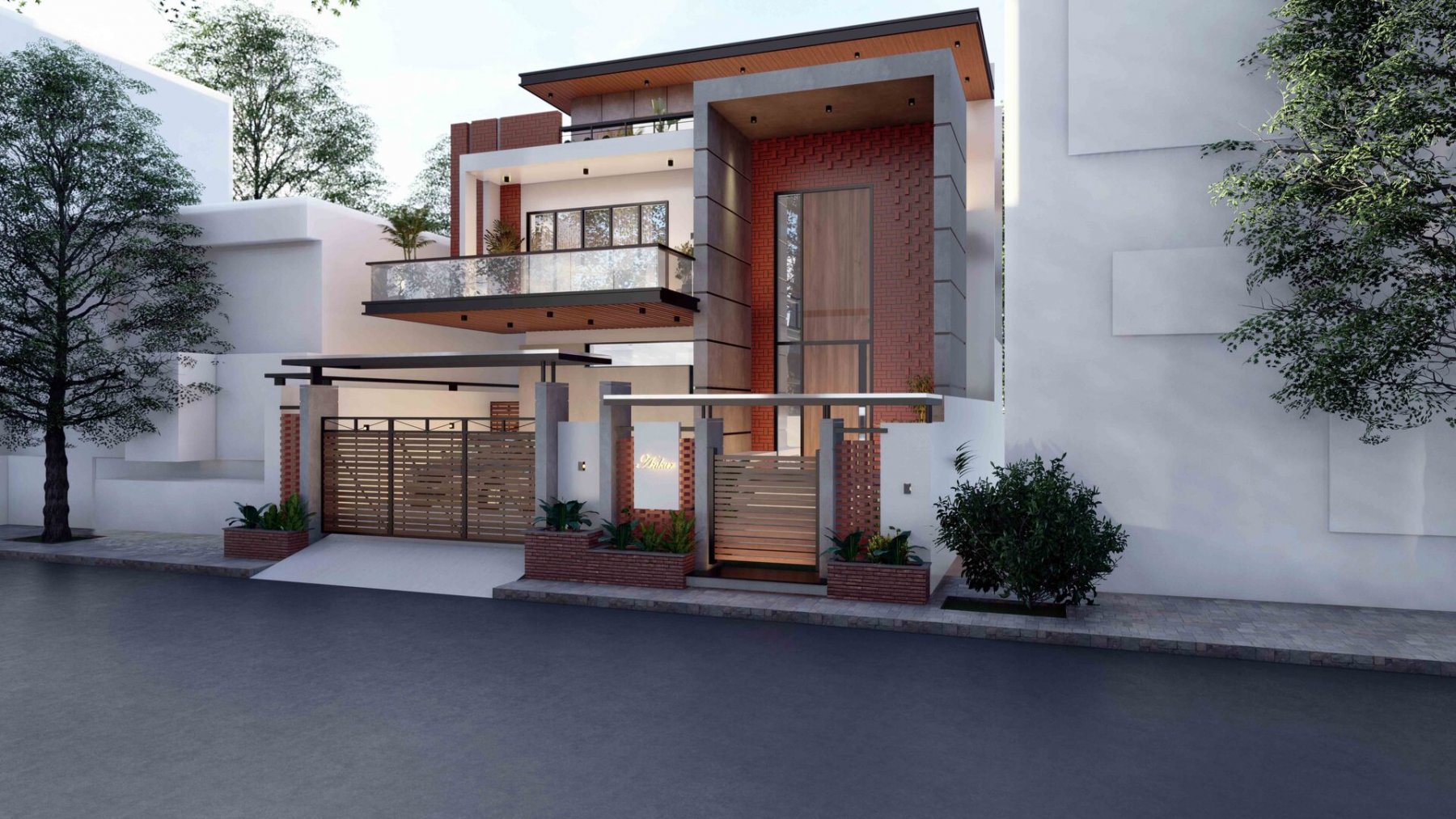
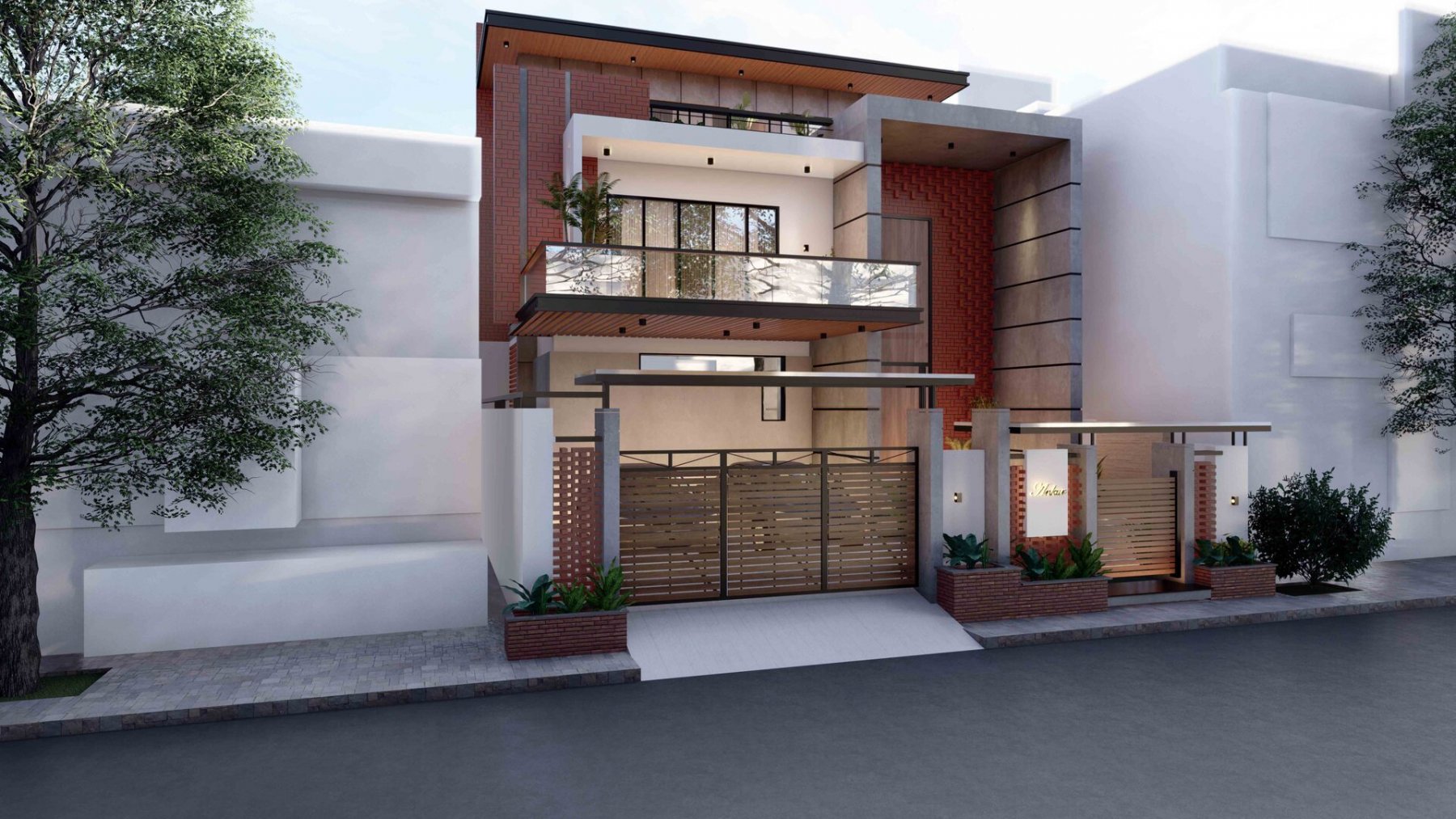
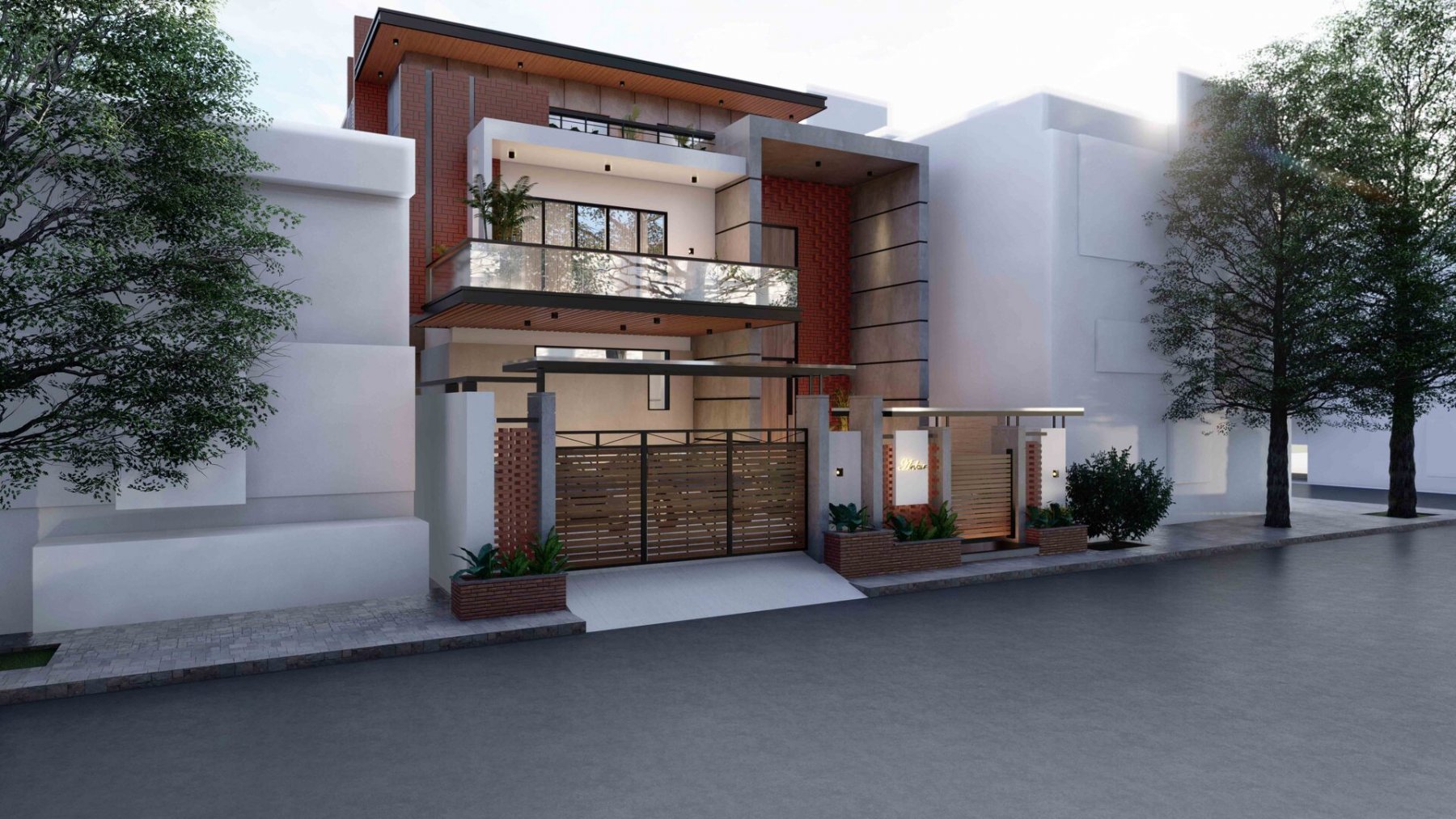
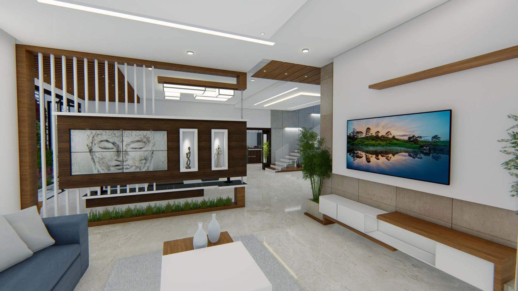
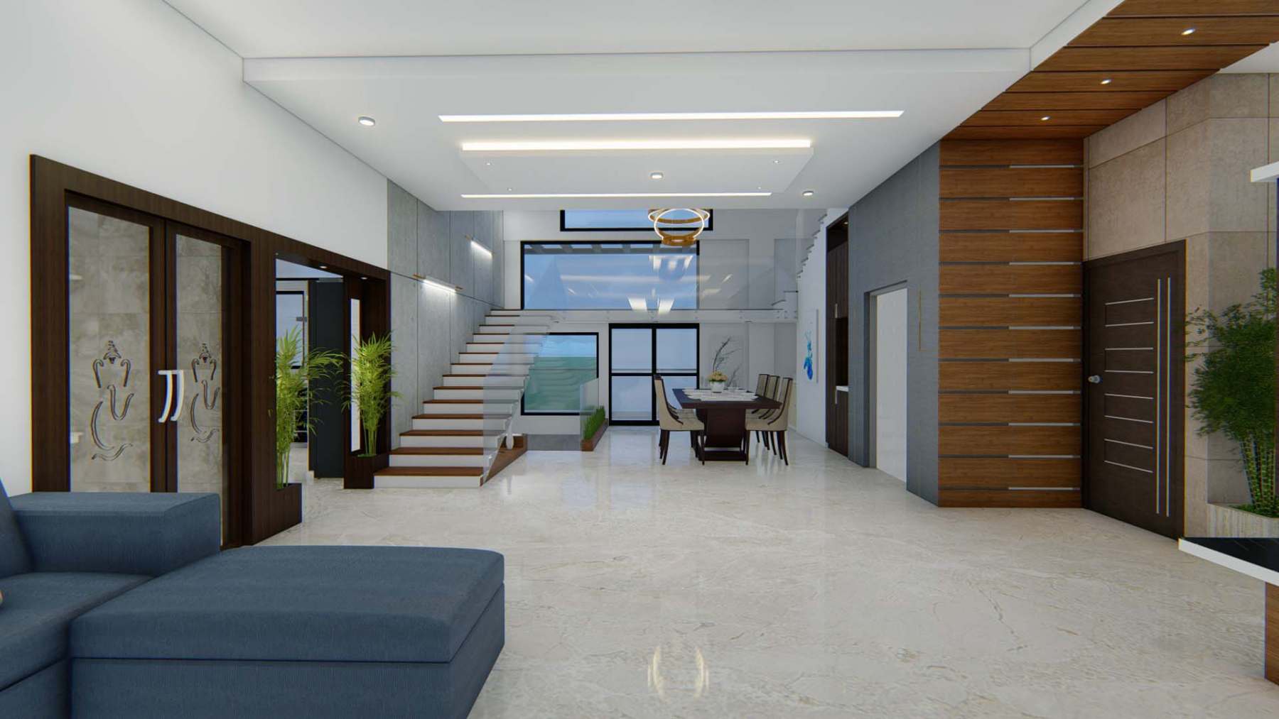
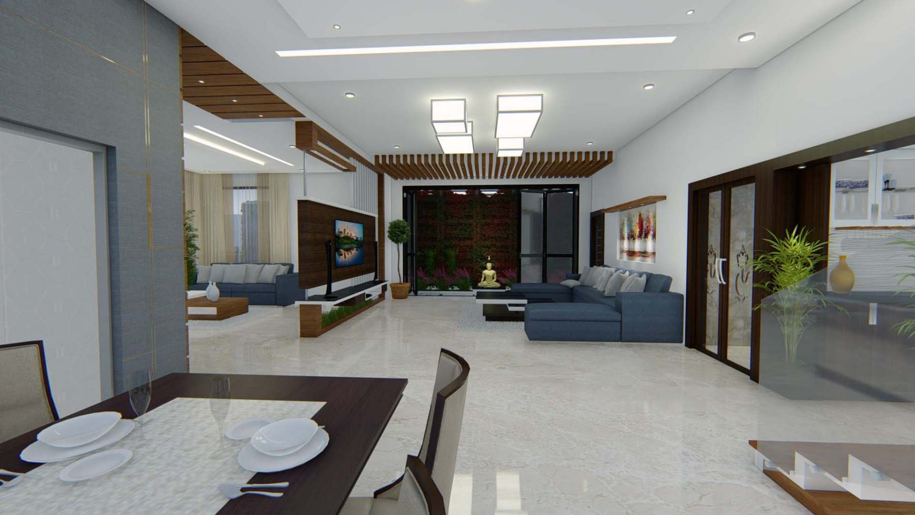
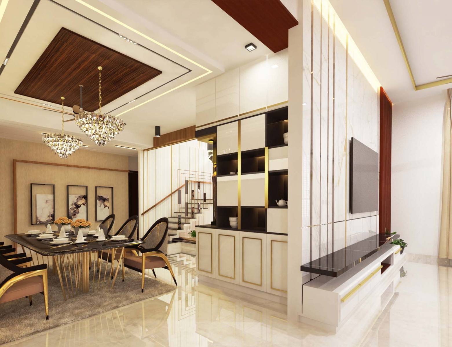
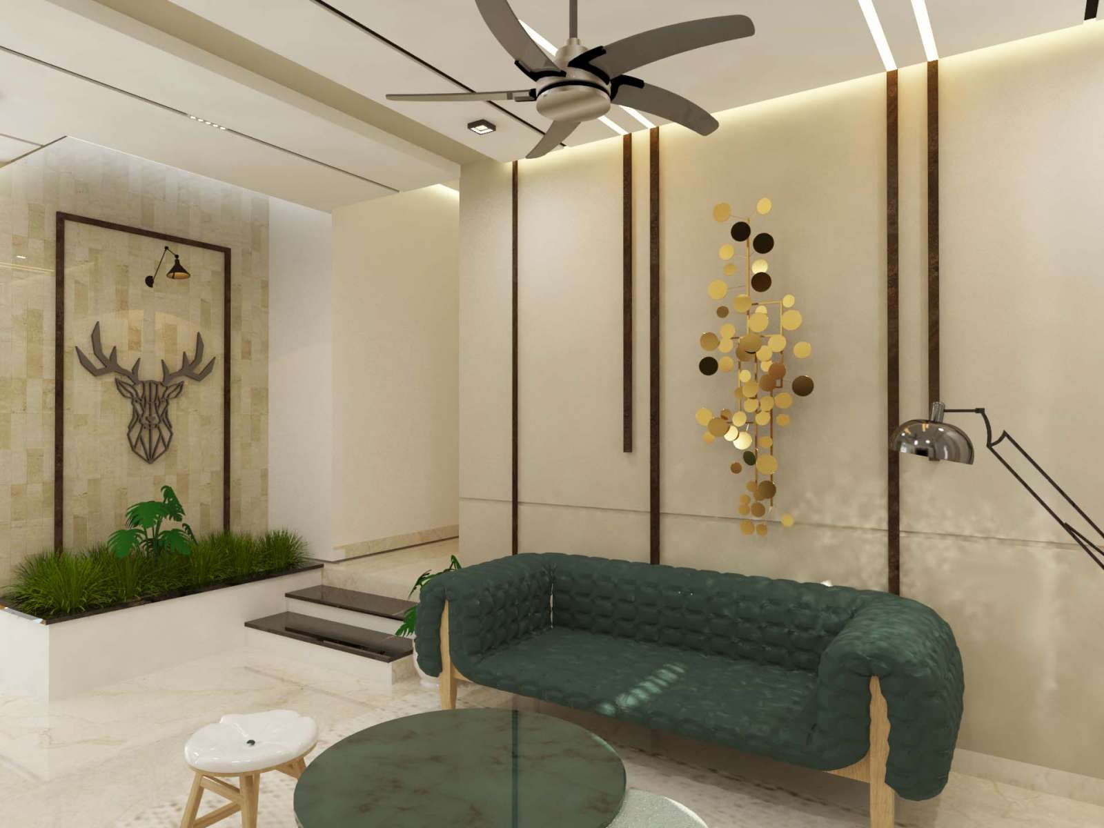
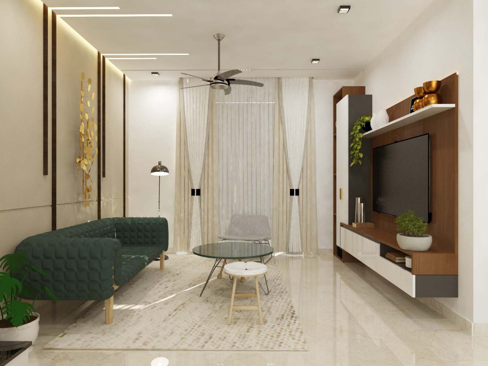
Combinations to make your home interior interesting:
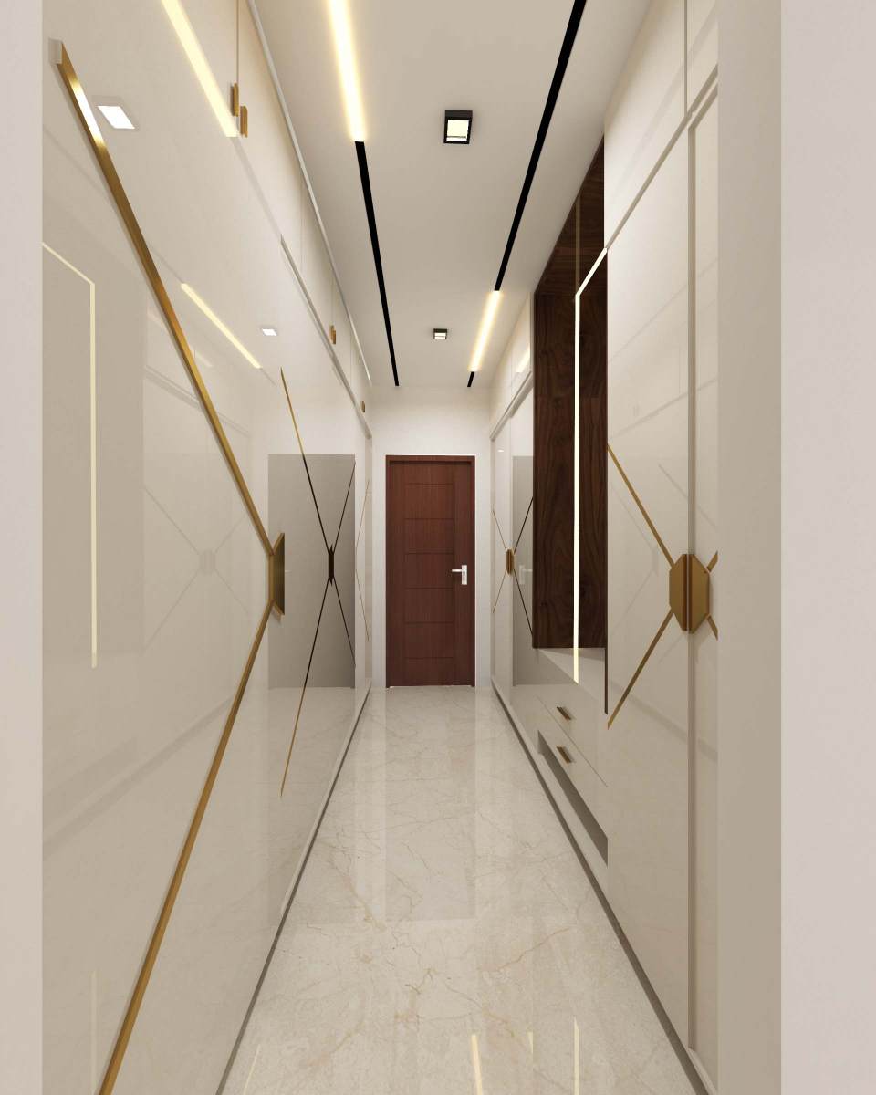
- Monochrome
Contrary to popular fashion dictate- monochrome isn’t black and white it is mono- chrome, or one-color. The good news is they are easy-peasy to pull together, and even more easy on the eye. The bad news is they can appear boring. So, a great approach if you are designing a house to sell for example- monochrome will be a people pleaser for sure, but to live with all the time? Boring!! The key to getting your monochromatic scheme to sing is to use all the different tones and tints of the color in mind. This is what will keep it interesting. And it makes using bold or contrasting patterns very simple to incorporate- as you just match them by color.
- Simplicity comes with the harmonious or analogous colors
Choose two or more colors that sit side by side on the color wheel and you get what’s called an Analogous or more commonly known as Contrasting or Harmonious colors. Whatever, what you need to know is that this is where all the colors are easily friends- it’s like they come from the same family. So, sit red next to pink, blue next to violet or yellow with green. For example, when creating a design from scratch using analogous colors, you wouldn’t have equal amounts of each color in the design. Typically, you would choose just one ‘mother’ color and then use the rest to compliment it in your design. There are no specific rules, but 3-4 colors work best.
Colors complementing pastels
- Richer hues
A small dose of pastel color paired with a richer hue, such as cobalt blue or maroon, is useful for lightening the mood of what might otherwise be a somber scheme.
- Metallic infusion
The ethereal beauty of pastels is enhanced with delicate metallic accents. Try combining pastels with warm metallics like copper or gold to create contrast and conjure a luxurious mood.
- Muted navy palette
Looking for a sophisticated way to use pastel colors? Navy is perennially chic, and helps you to anchor the breezy jasmine and pastel blue. This is the elegant and grown-up scheme for interior and stationery design.
- Edgy ice cream palette
Combining muted pastels with edgier black creates a high-contrast palette that is reminiscent of 1980s design styles. This is an on-trend scheme that would be especially effective for brand design.
- Retro sport
Who thought pastel lavender could be so appealing? Combined with terra cotta orange and emerald green, pastels take on a fresh and sporty mood. A contemporary update on 1950s palettes, this scheme is stylish and versatile.
What’s Hot?!
- Illuminating and ultimate grey

Forget orange – grey is definitely the new black. Take this interesting duo – lime green and grey. Grey can be warm or cool, hard or soft, it is exceptionally versatile and flattering. The zesty lime green packs a serious punch and could be garish if it was paired with something equally strong. Teamed with a flat dark grey, it creates harmony and becomes a really cool and contemporary combination. Traditionally grey has a reputation of being flat or dreary, but greys status has been elevated off late, and now it is synonymous with sophistication. If you are a student or a person who lives alone and loves the cool vibe place, you can just opt this combination in your room which will enhance the vibes of the room making it edgy. The interior design in Jaipur has taken a turn to this spirited combination in the interior and our team of top interior designers will bring out the best in your interiors with this amazing duo.
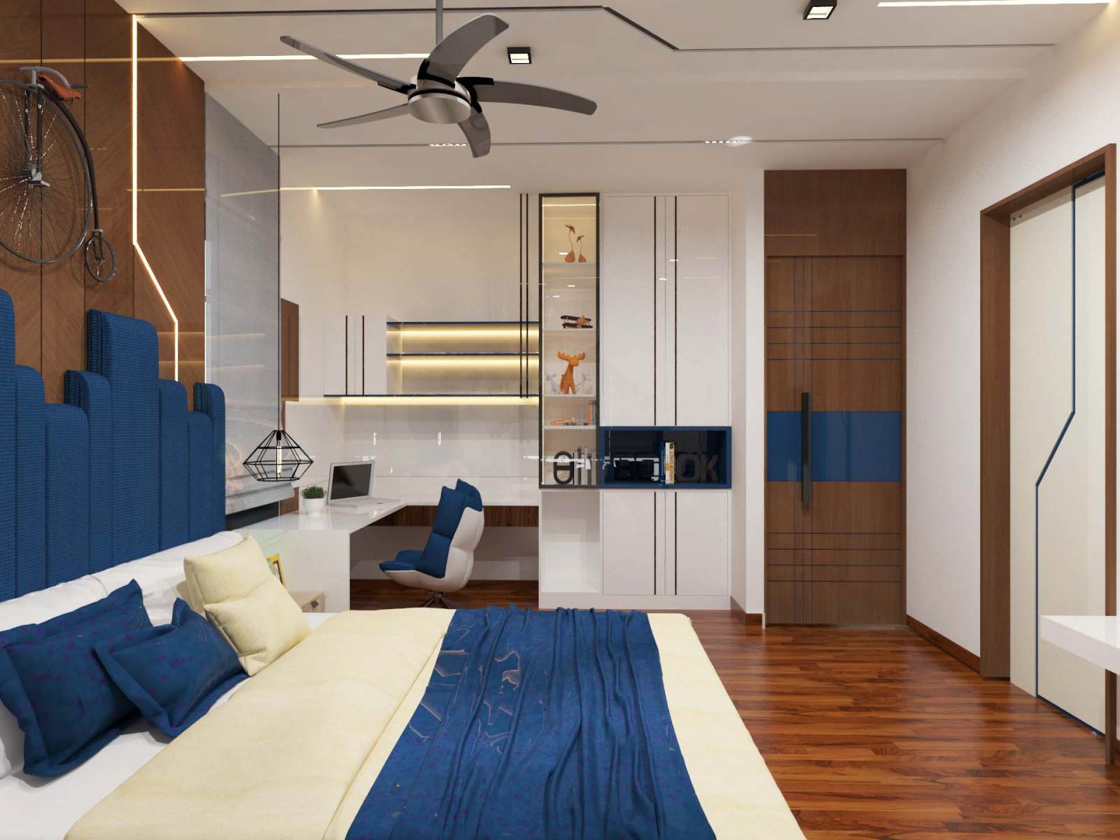
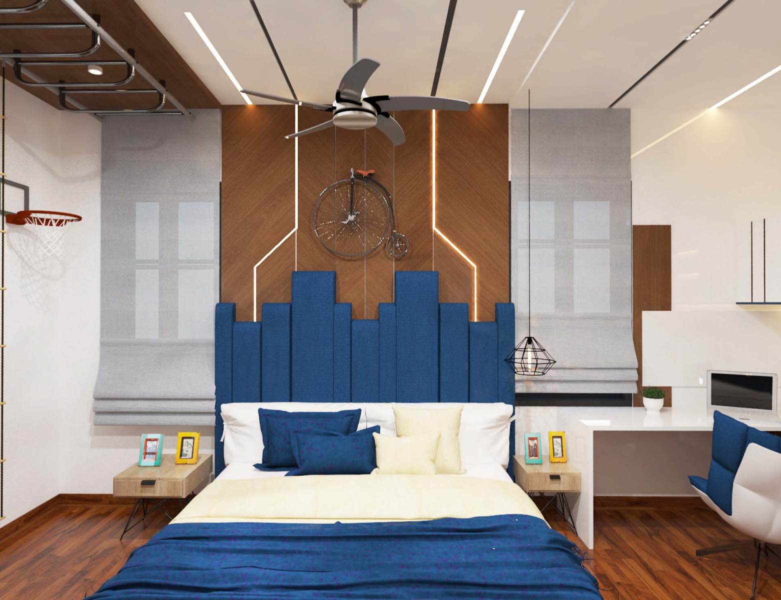
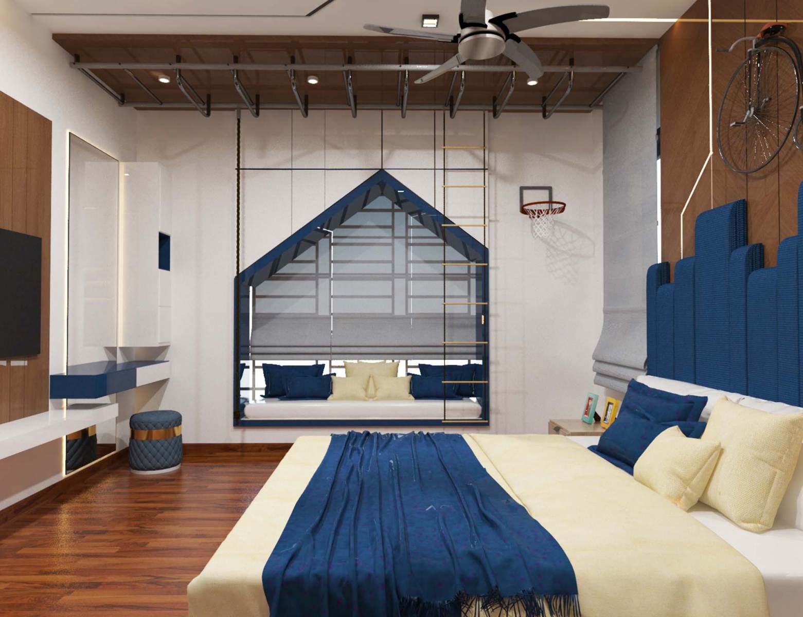
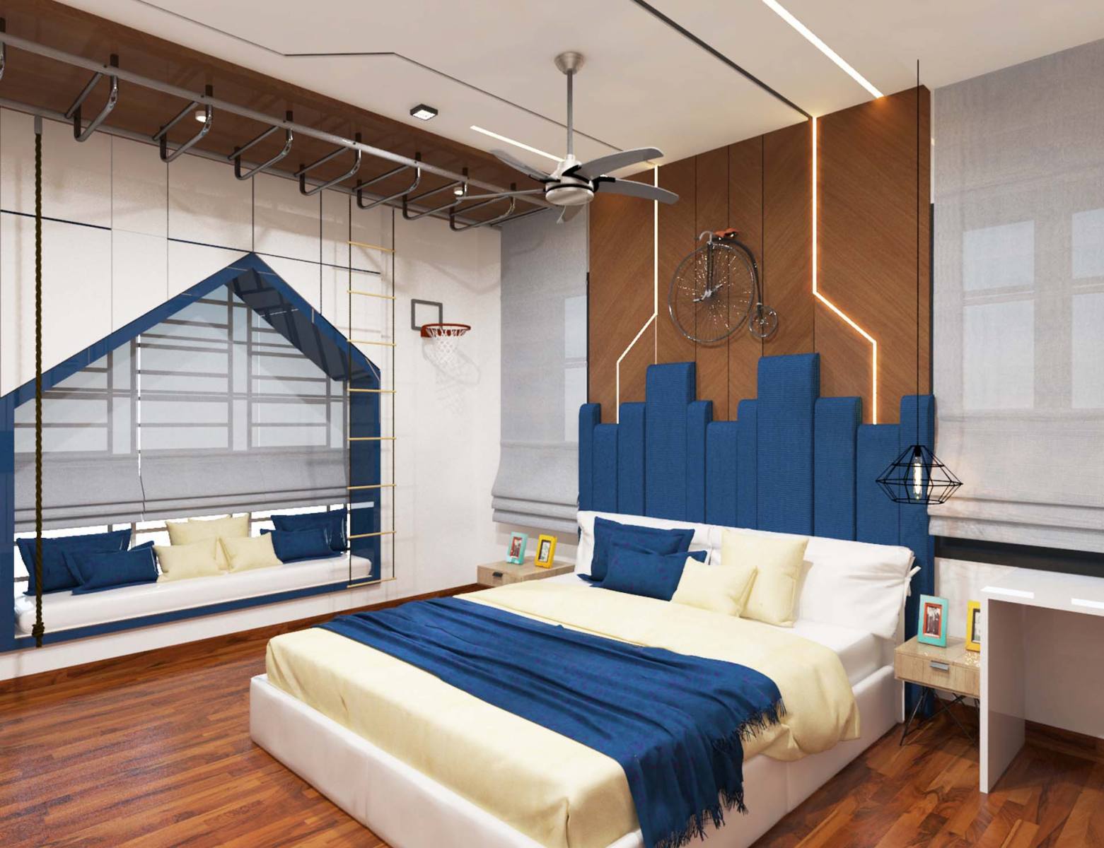
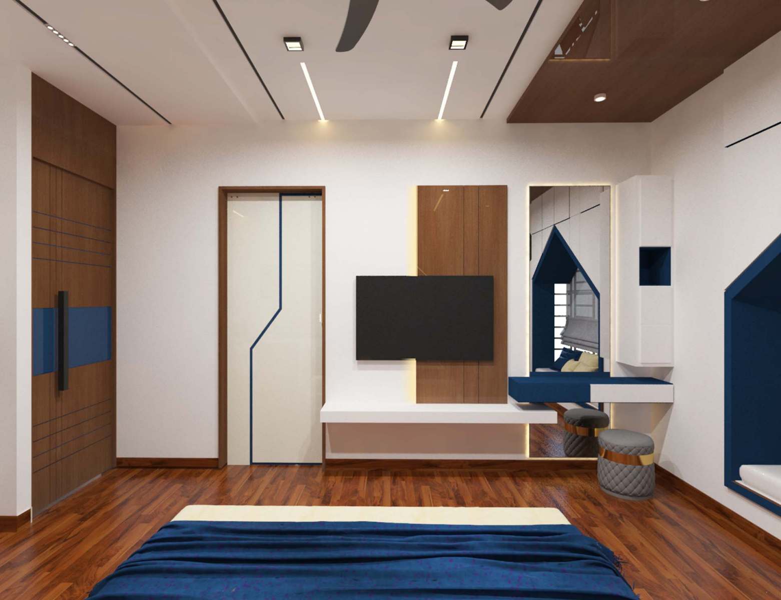
- Naval blue

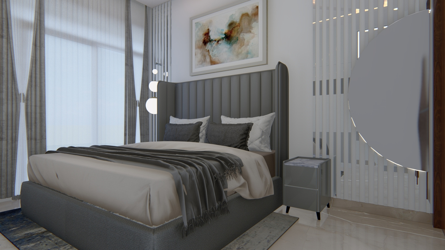
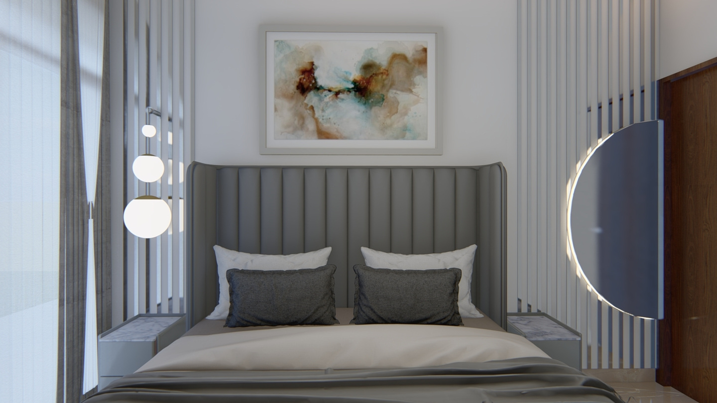
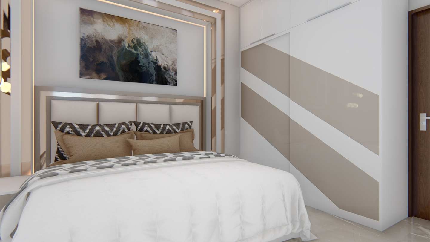
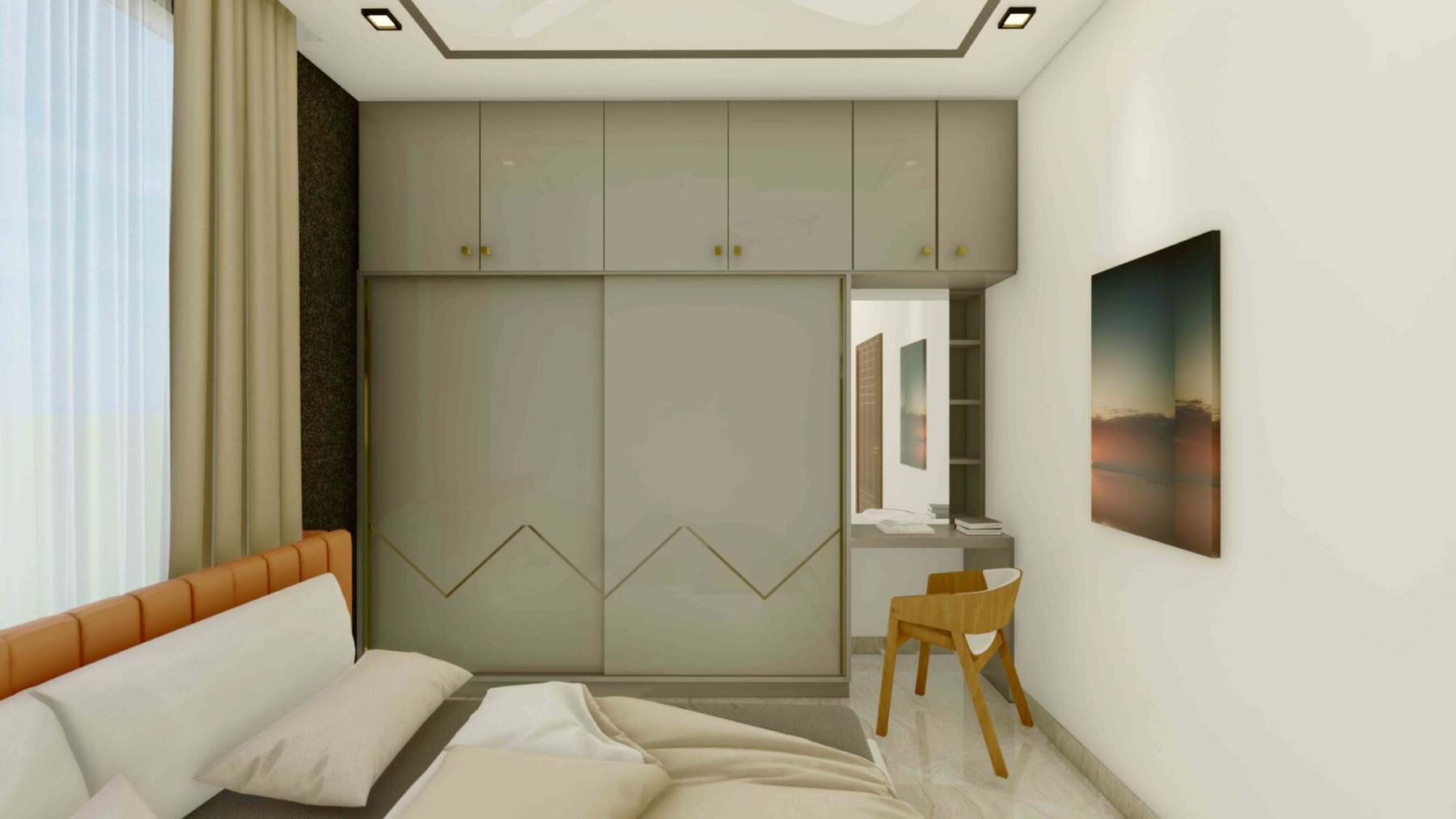
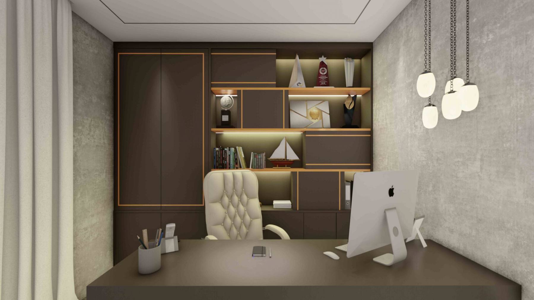
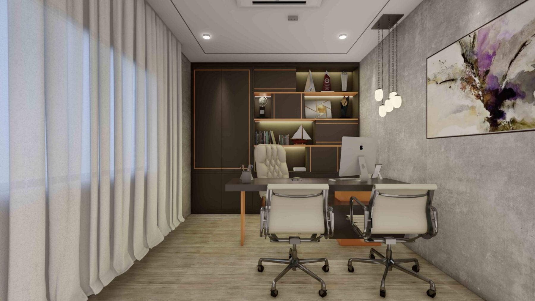
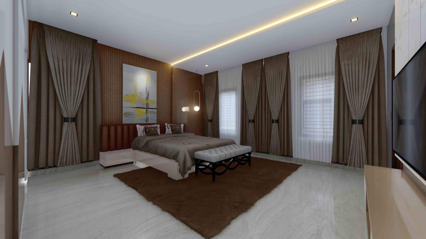
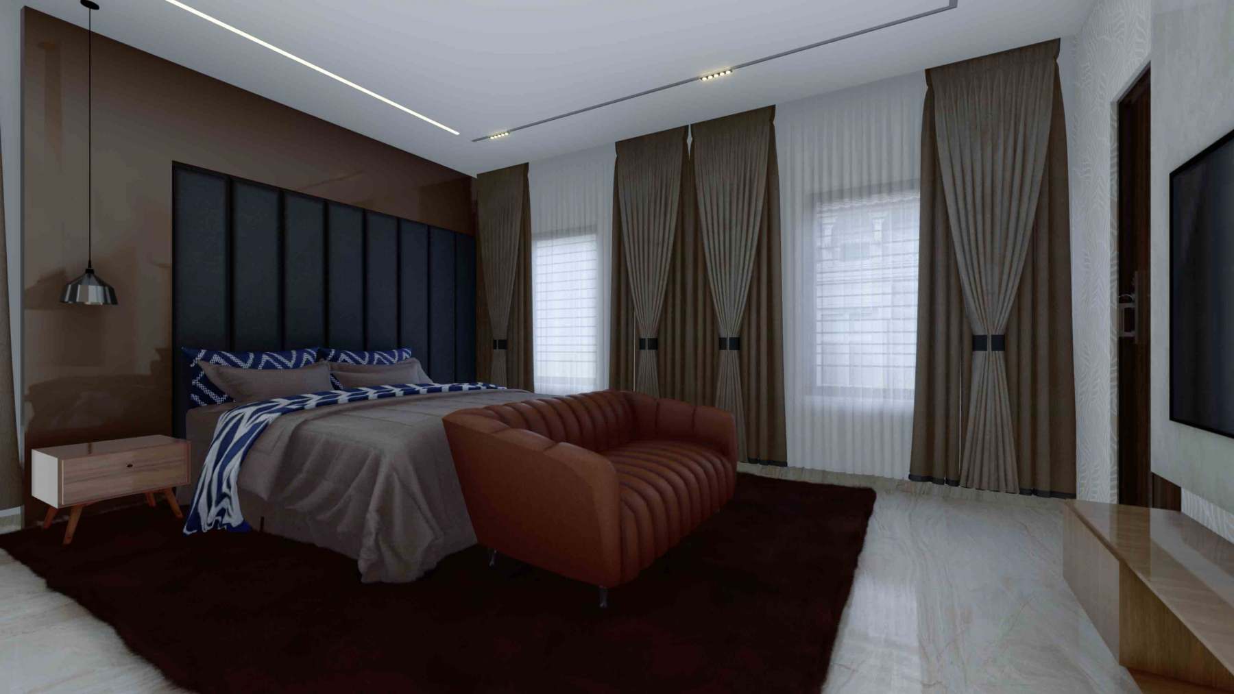
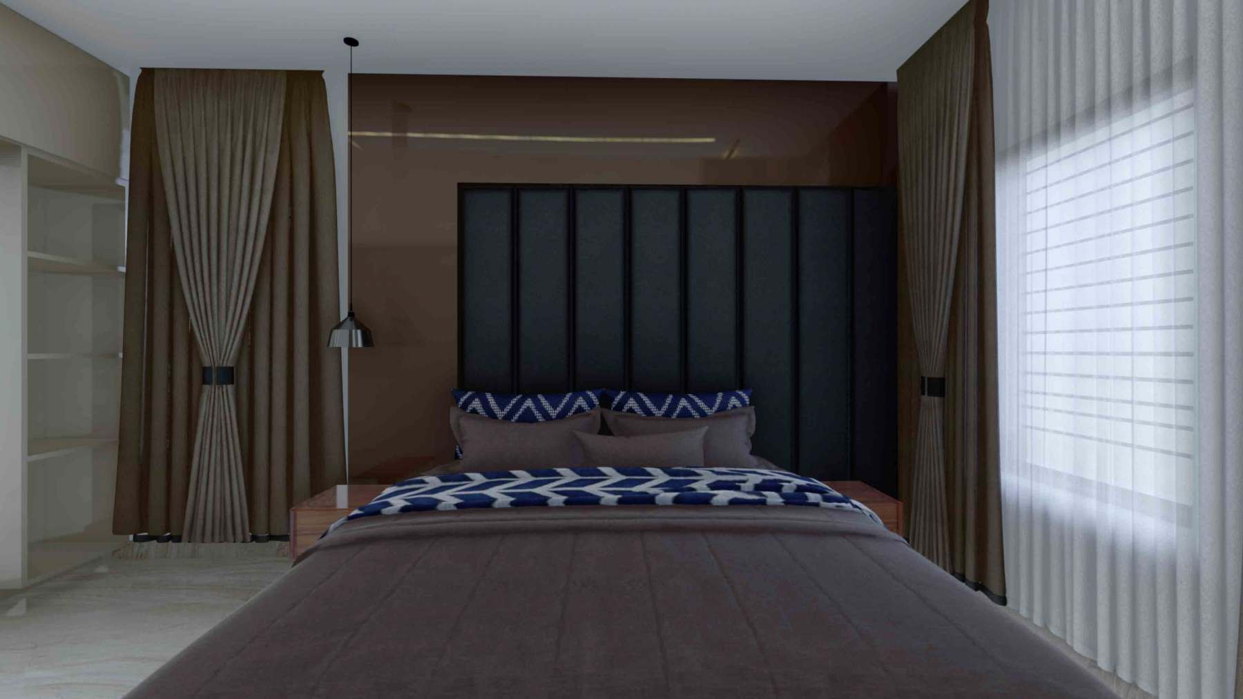
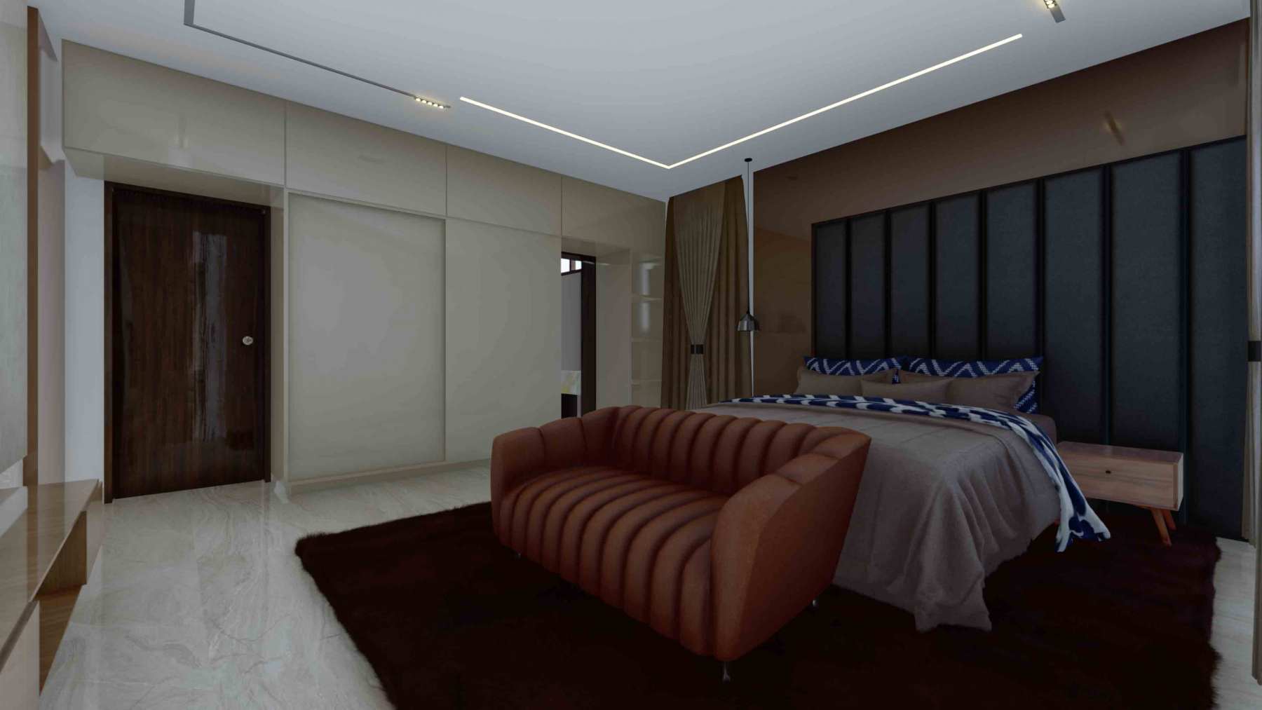
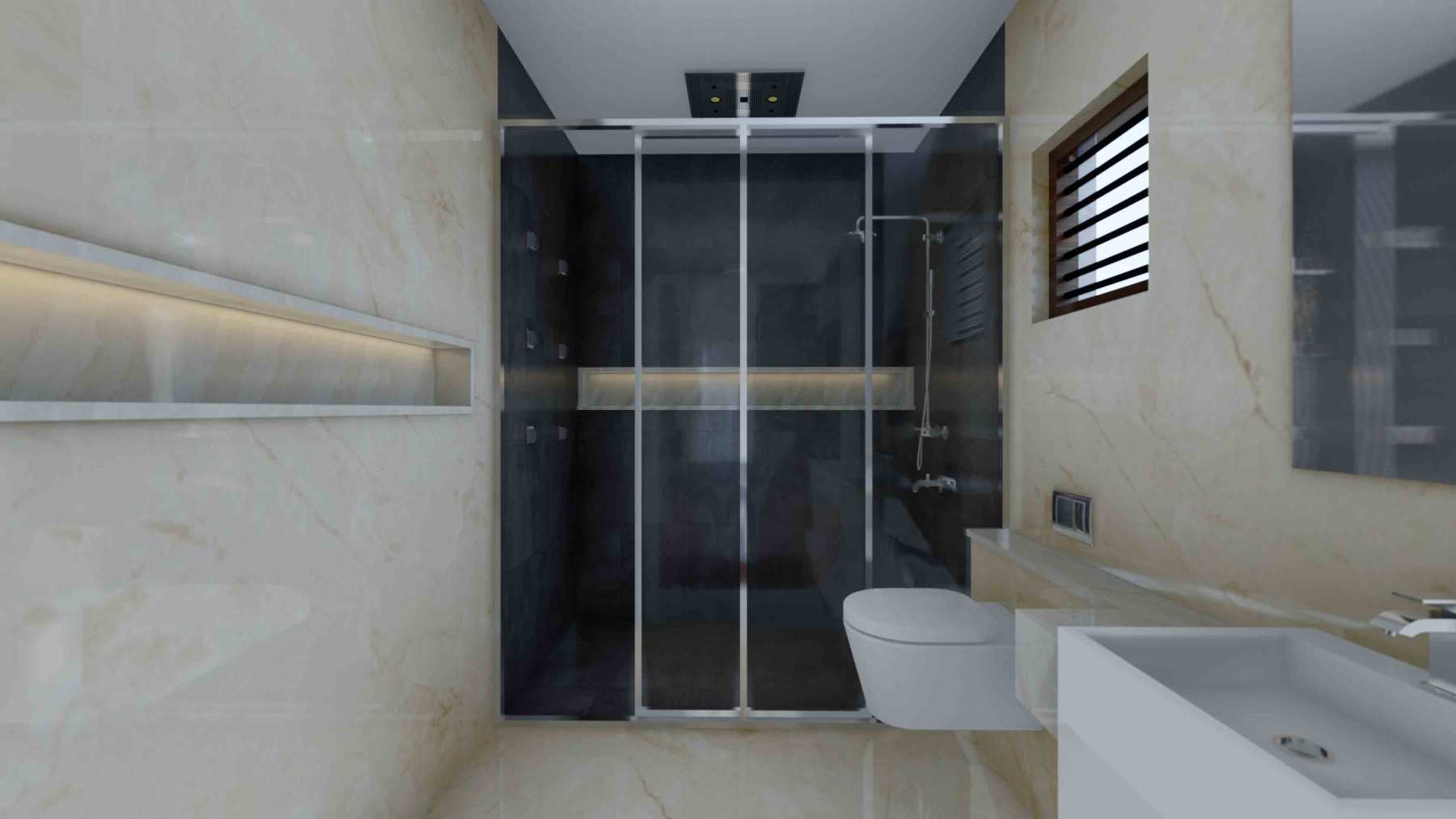
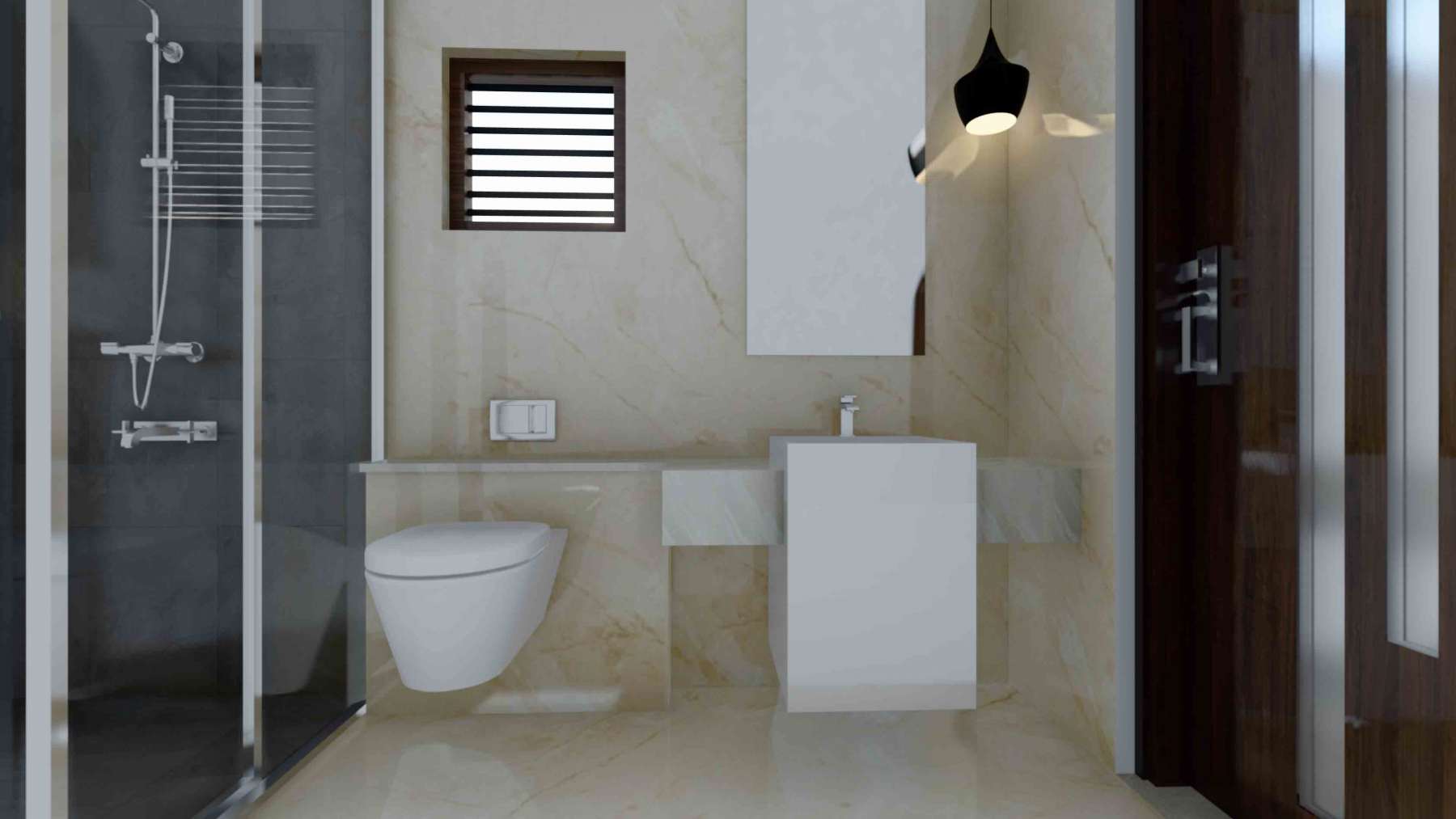
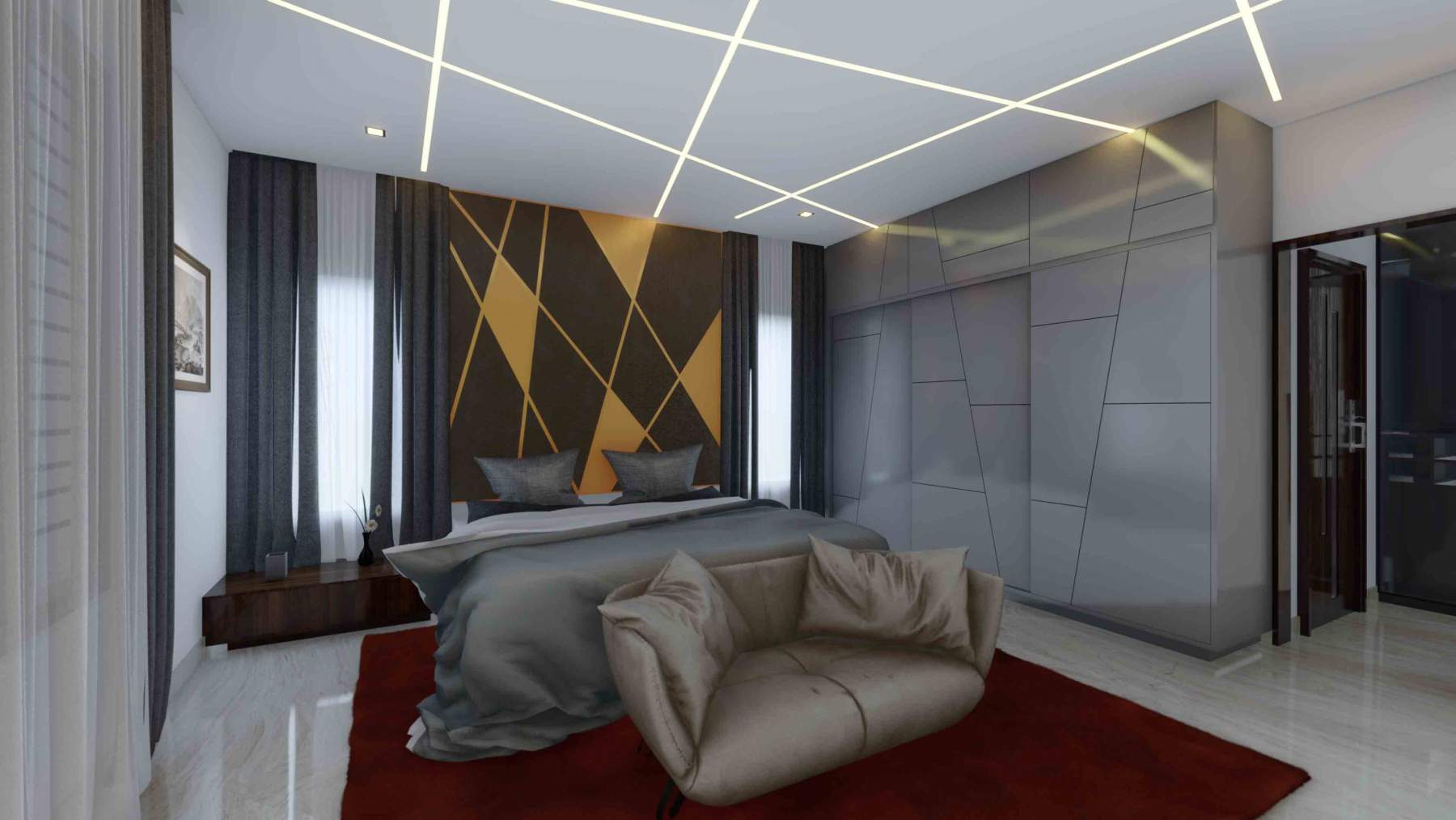
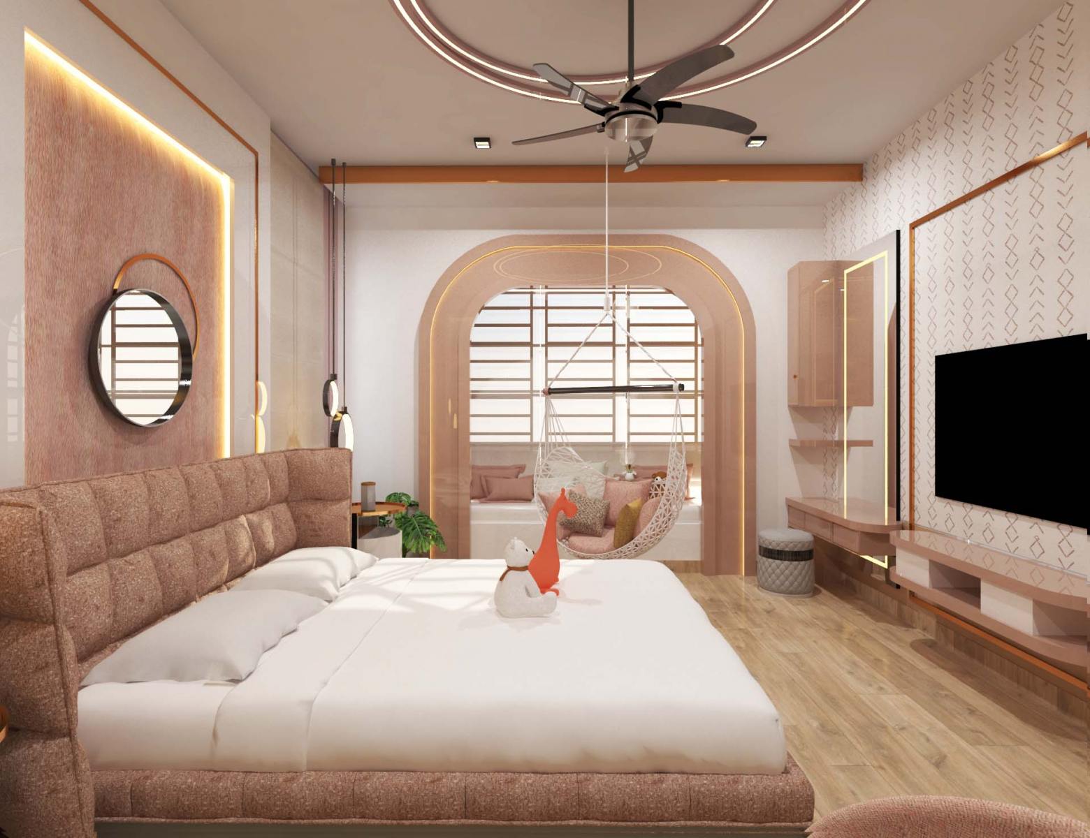
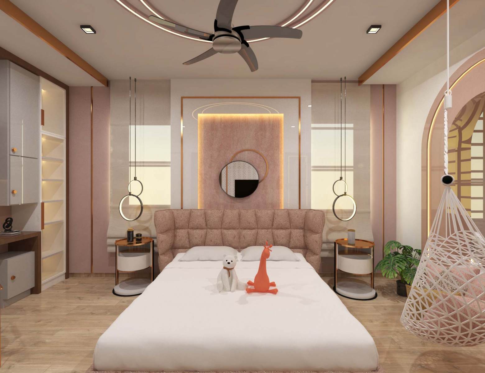
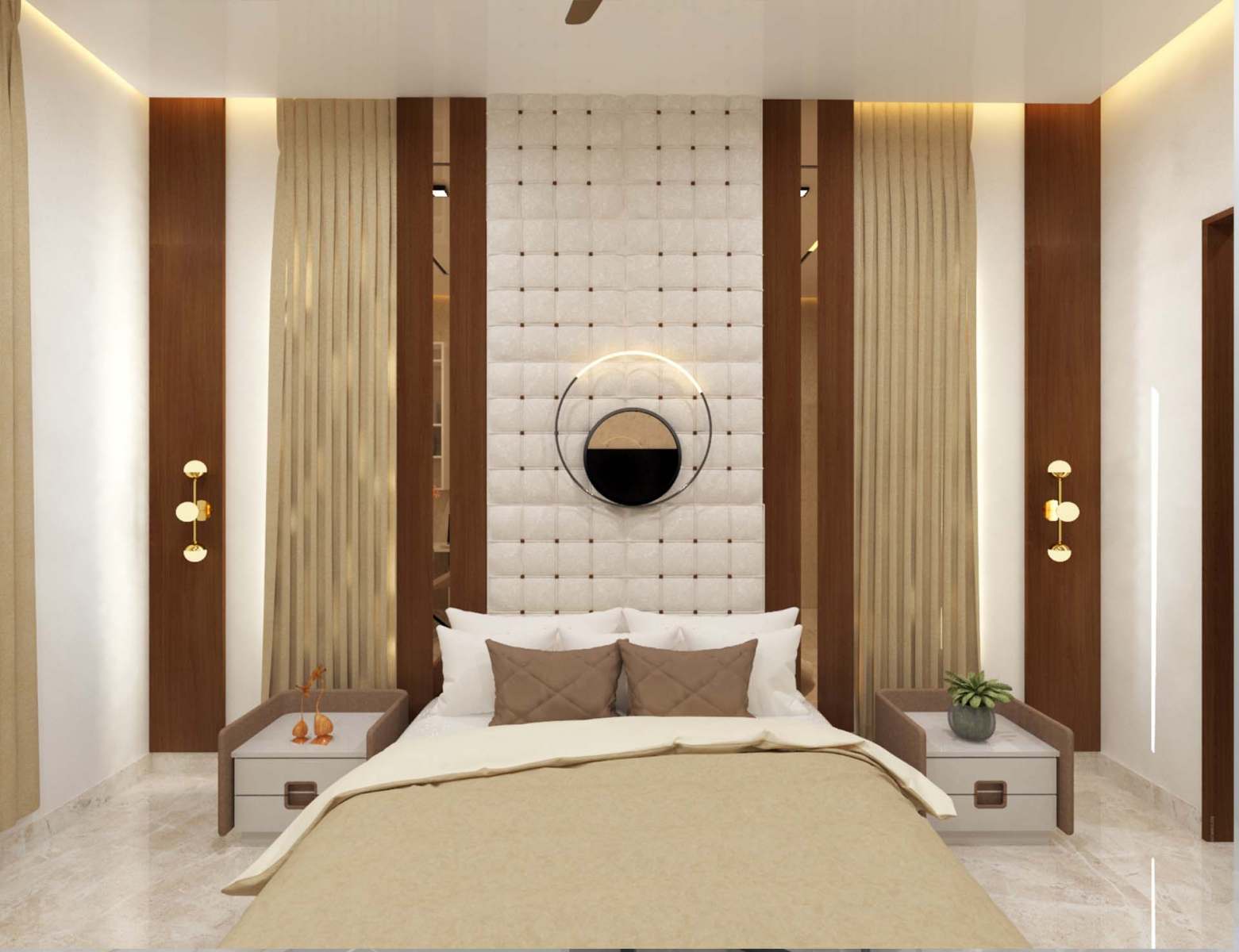
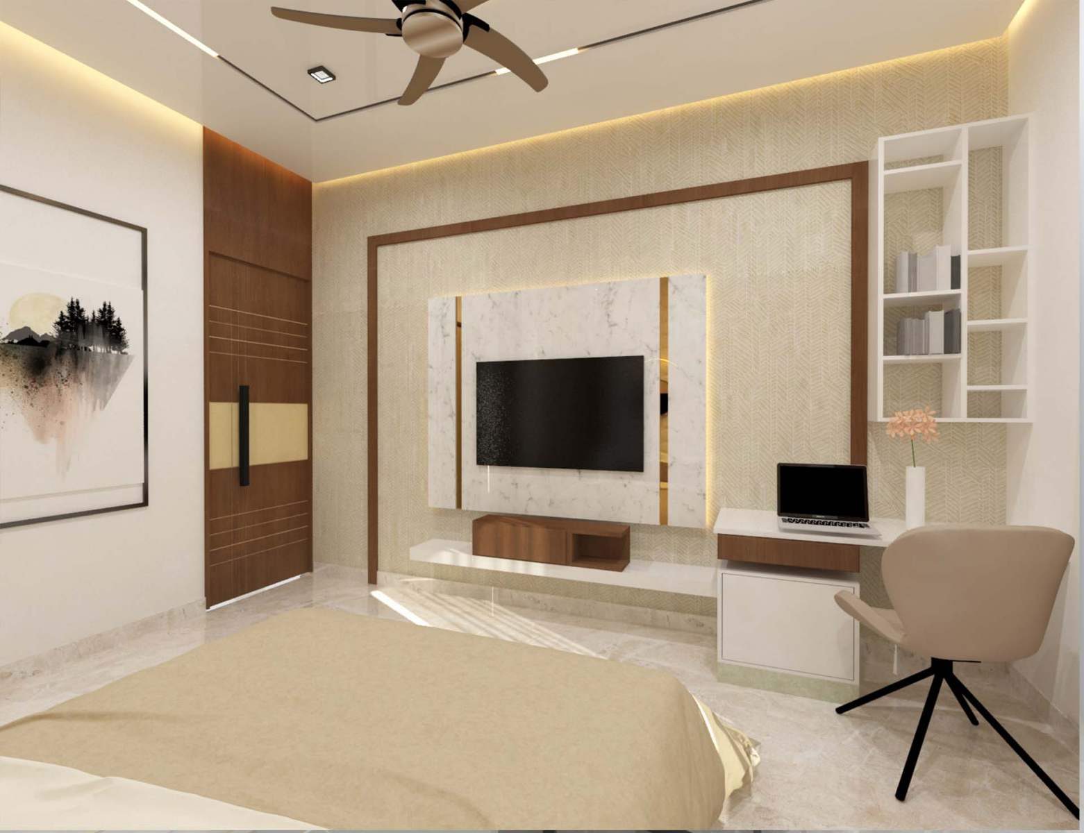
Blue is no doubt, one of the strongest hues in the color psychology spectrum. This color has of course long been a color to denote masculinity, often campaigns associated with men’s health overwhelmingly use blue. Deep, bold hues, such as navy and royal blue, are great for evoking confidence and are associated with admirable qualities such as loyalty, trust, peace and success. A dark navy blue is often used in interiors in the office rooms or professionally used places in the house as it conveys a sense of seriousness and professionalism. Use navy blue in your design for that corporate feel and conservative look. Lighter shades of the color instill a feeling a of calm and tranquility at home which makes them great for bedrooms, bathrooms and living spaces where you want to relax.
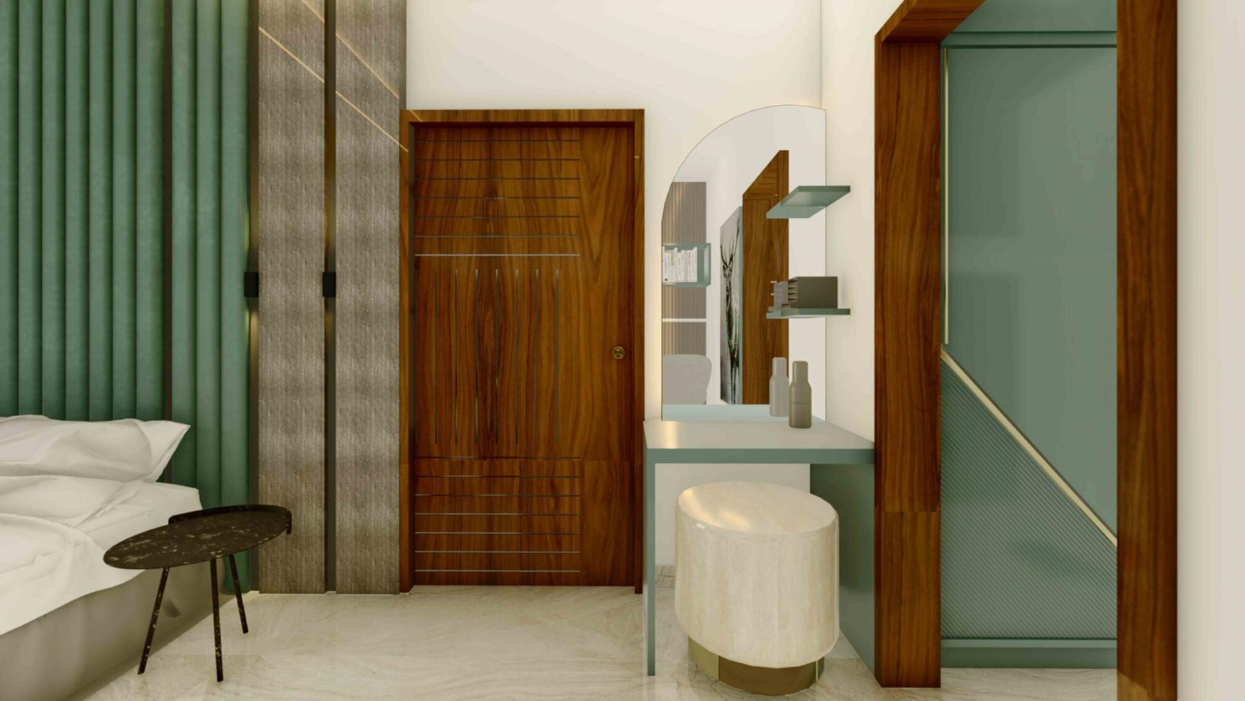
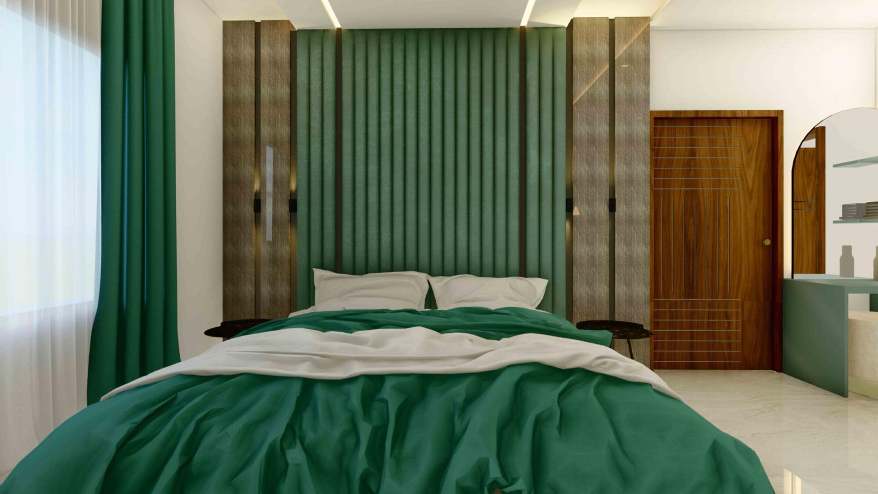
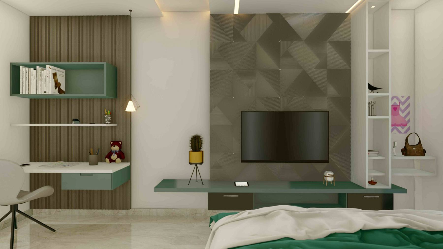
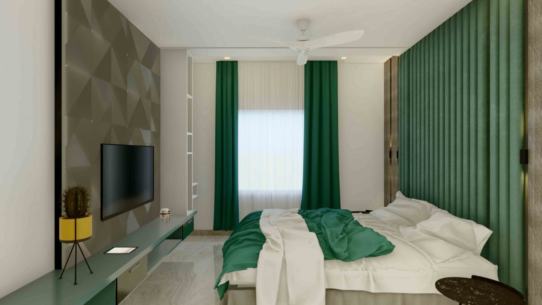
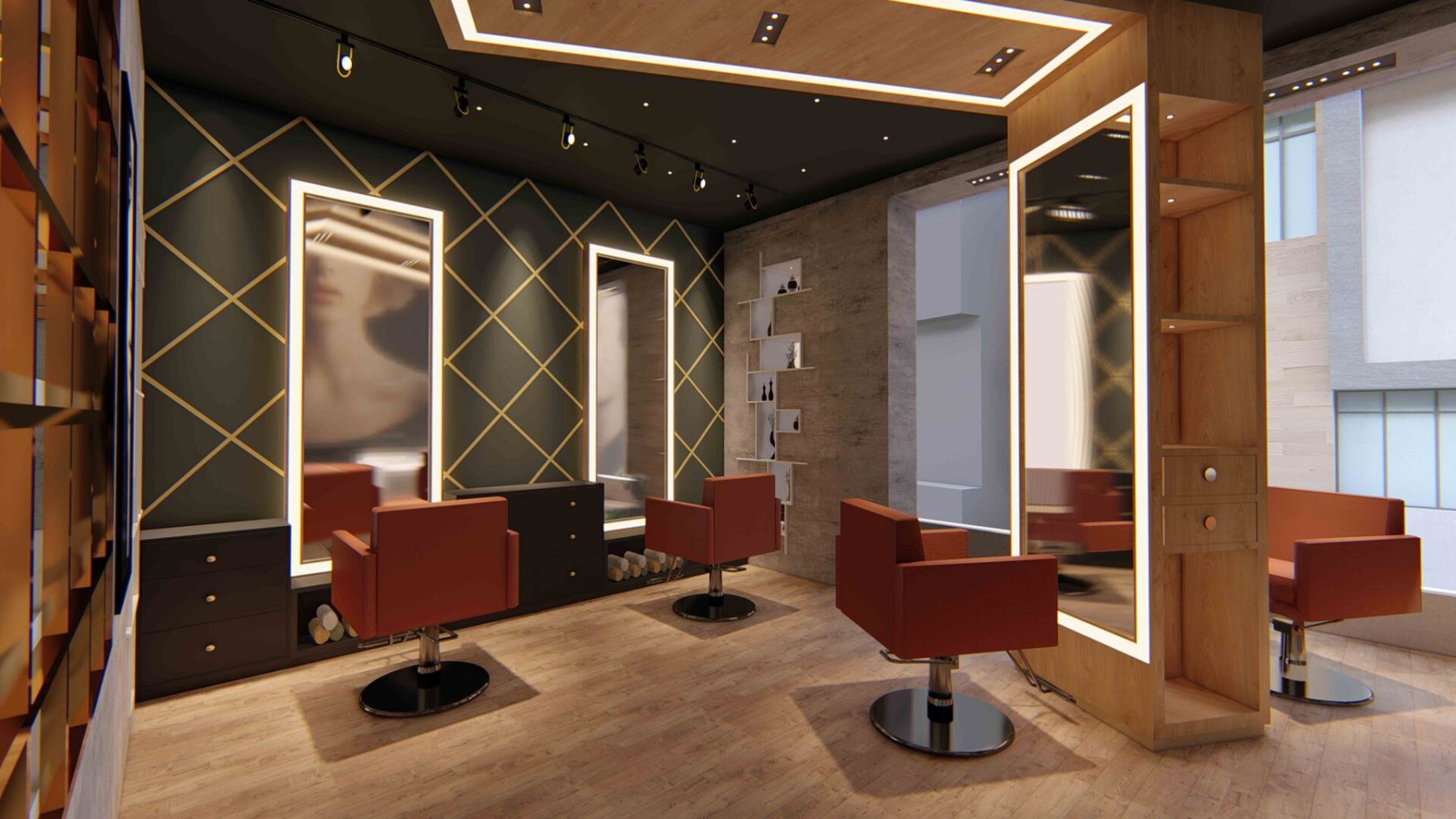
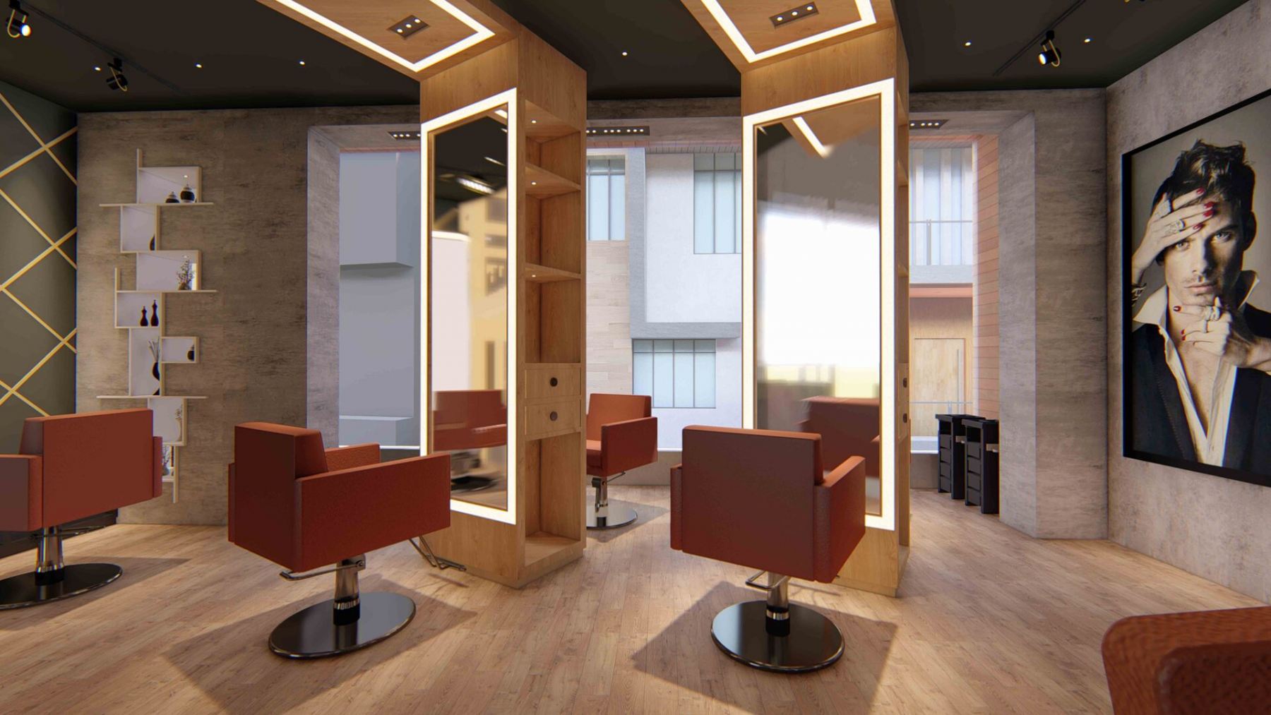
- Deep green with rich raspberry pink

Another pairing is this mysterious deep green combined with a rich rose pink. Deep Green is a gloriously deep color that makes you think of a lush and expansive forest. Raspberry is a deliciously fruity contrast that helps create a color combination which has a natural, wholesome flavor to it. The balance here between the masculine green and feminine pink is amazing, neither of which are too extreme in either direction. As Raspberry is a sort of pink-red color, it could take on a wide range of meanings in the eyes of the color psychology. This color combination could be fantastic for the living room as it can bring out the perfect balance of the place with the masculine and feminine mixture in the colors and will outshine the furniture and the lush green color will bring the nature feels in your house which will always keep you active. So, get this combination best for your living spaces done quickly to enjoy the vibes of passion and playfulness in your interiors with the top interior designers in Jaipur.
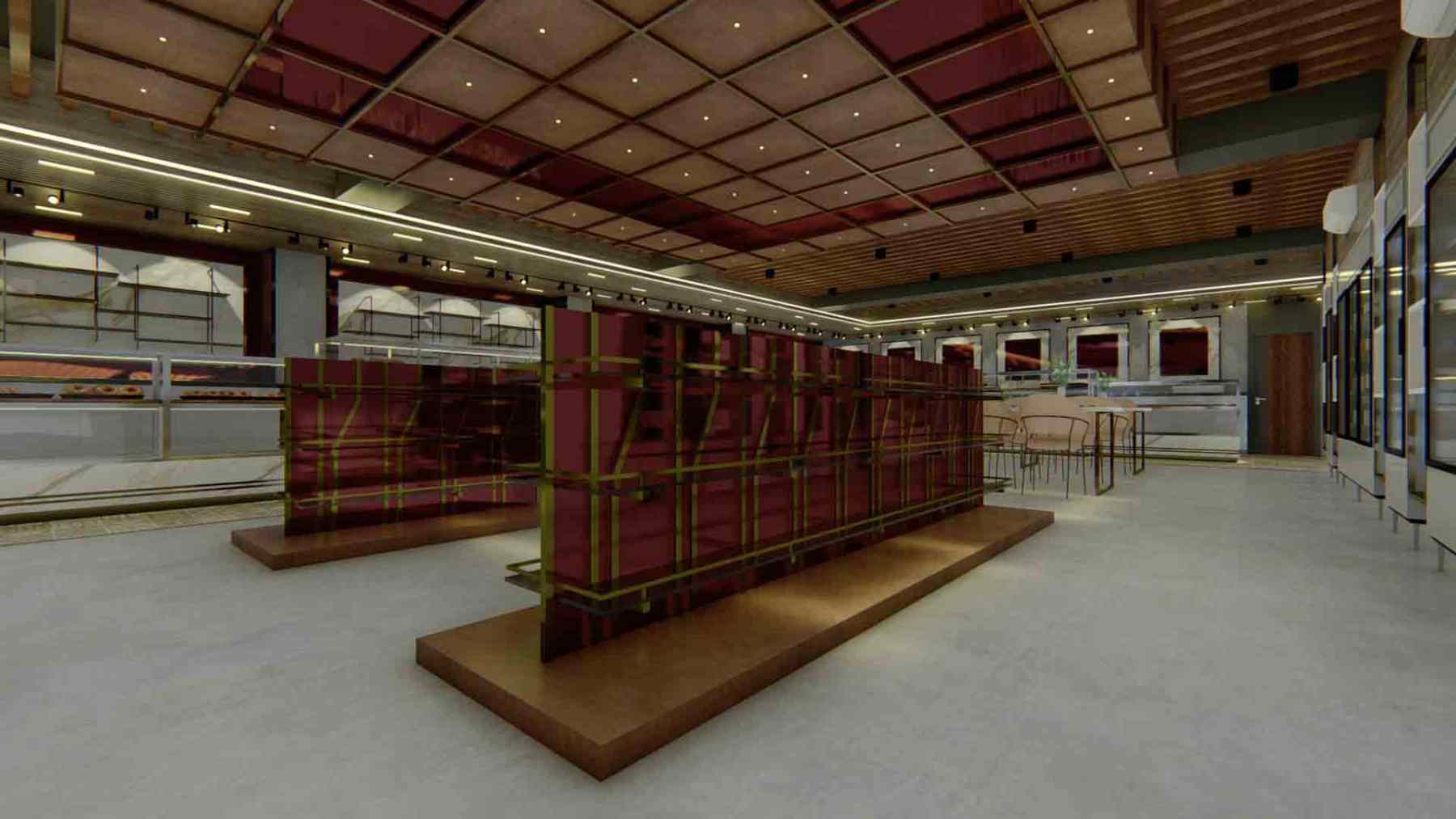
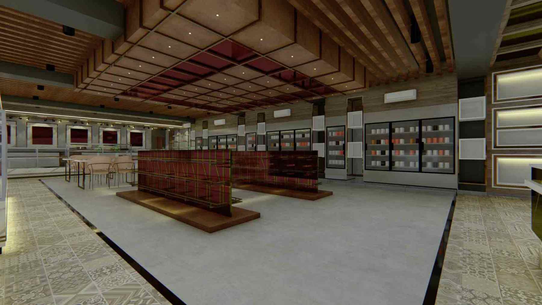
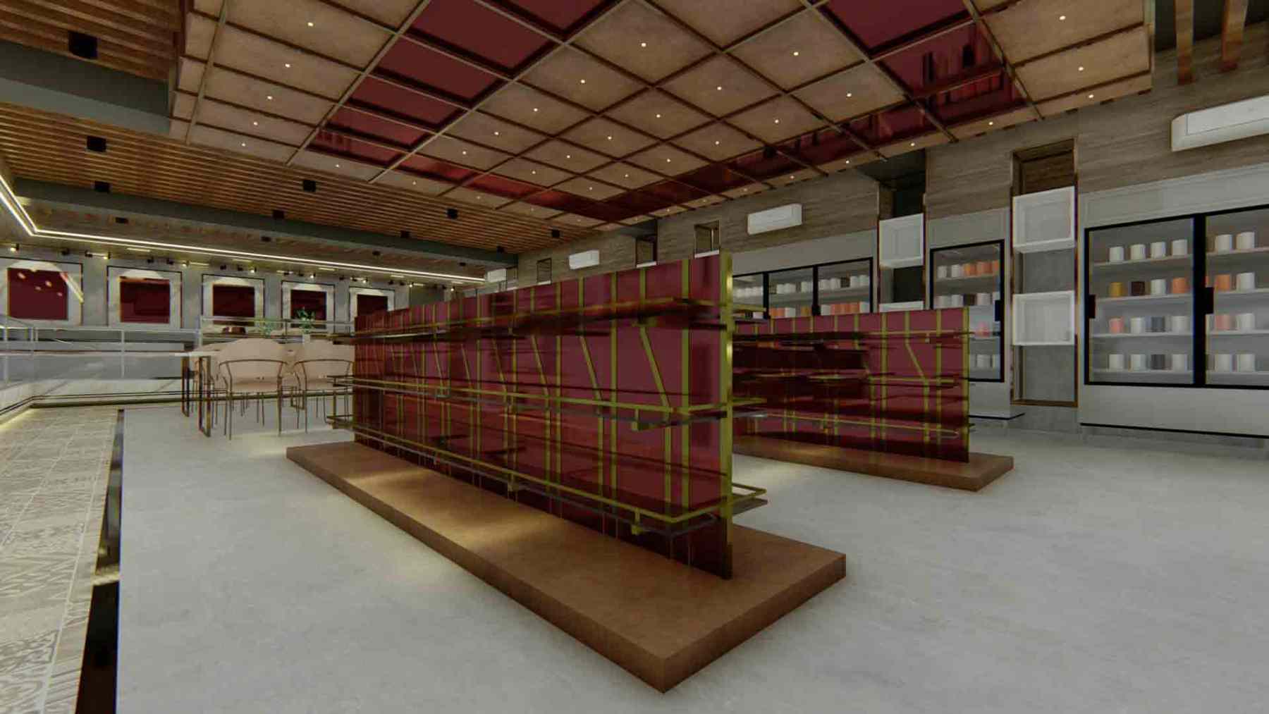
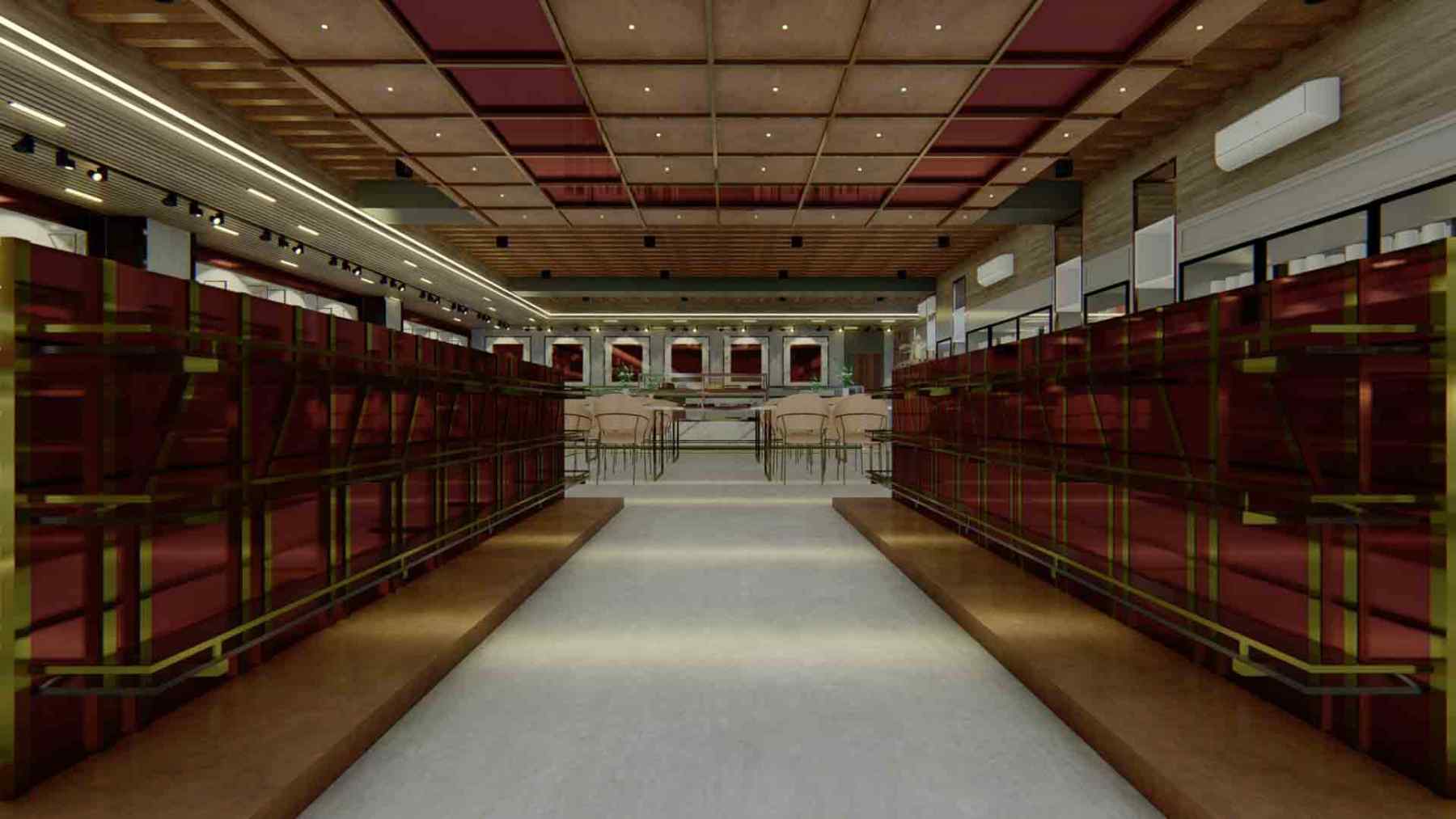
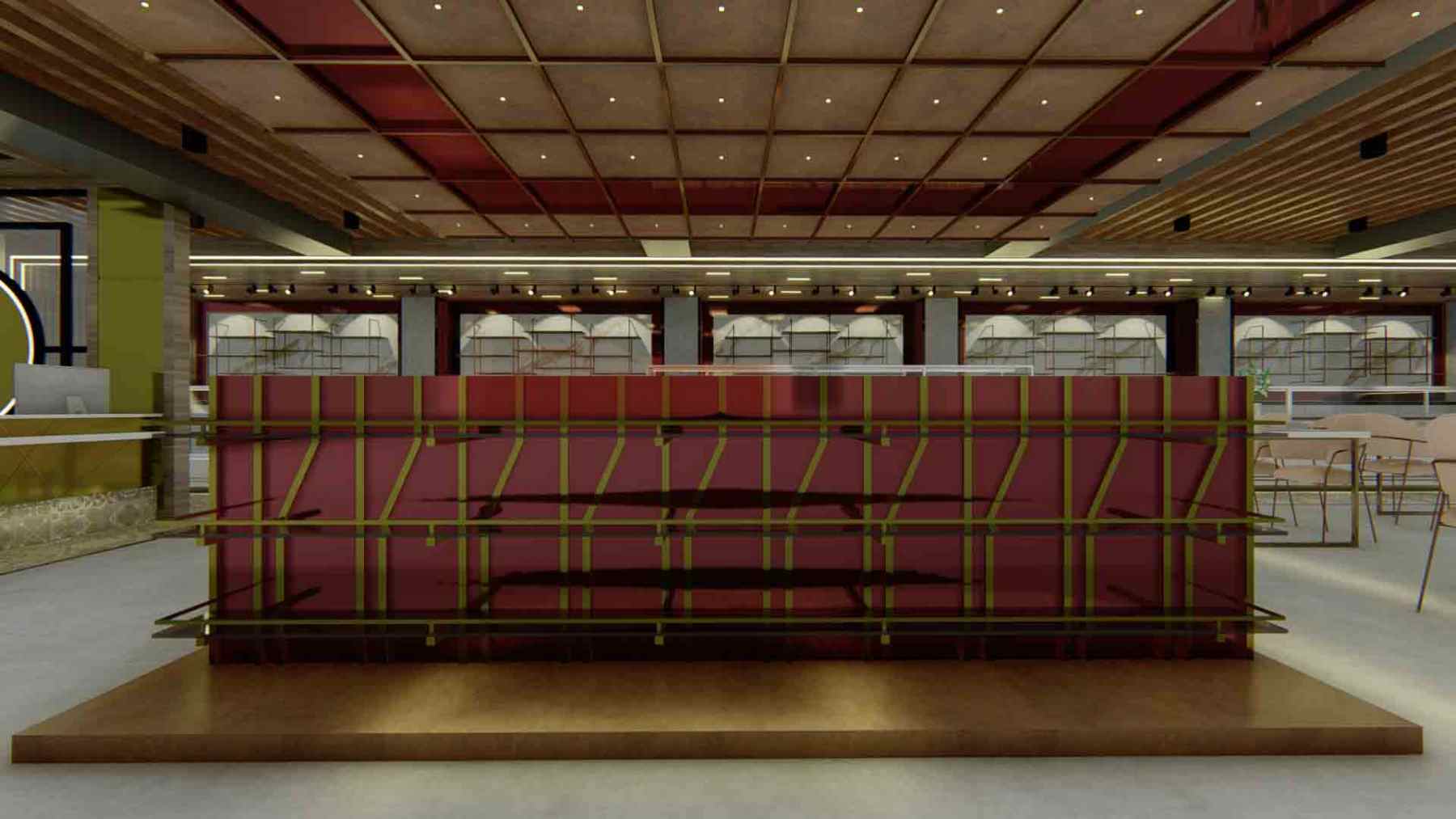
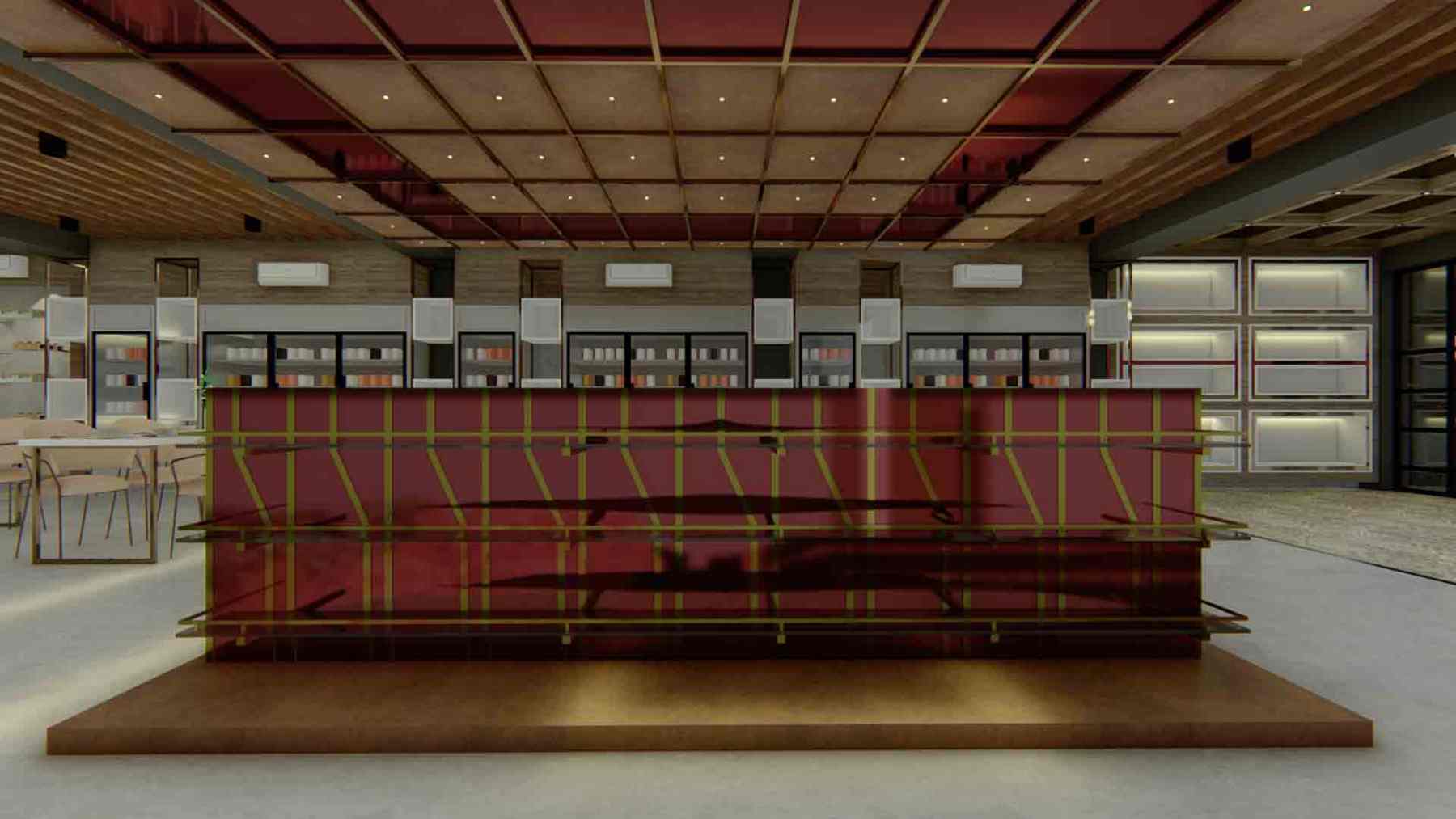
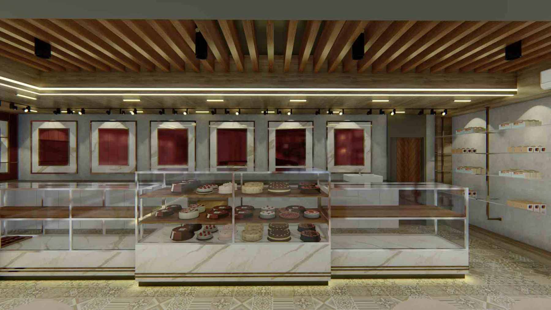
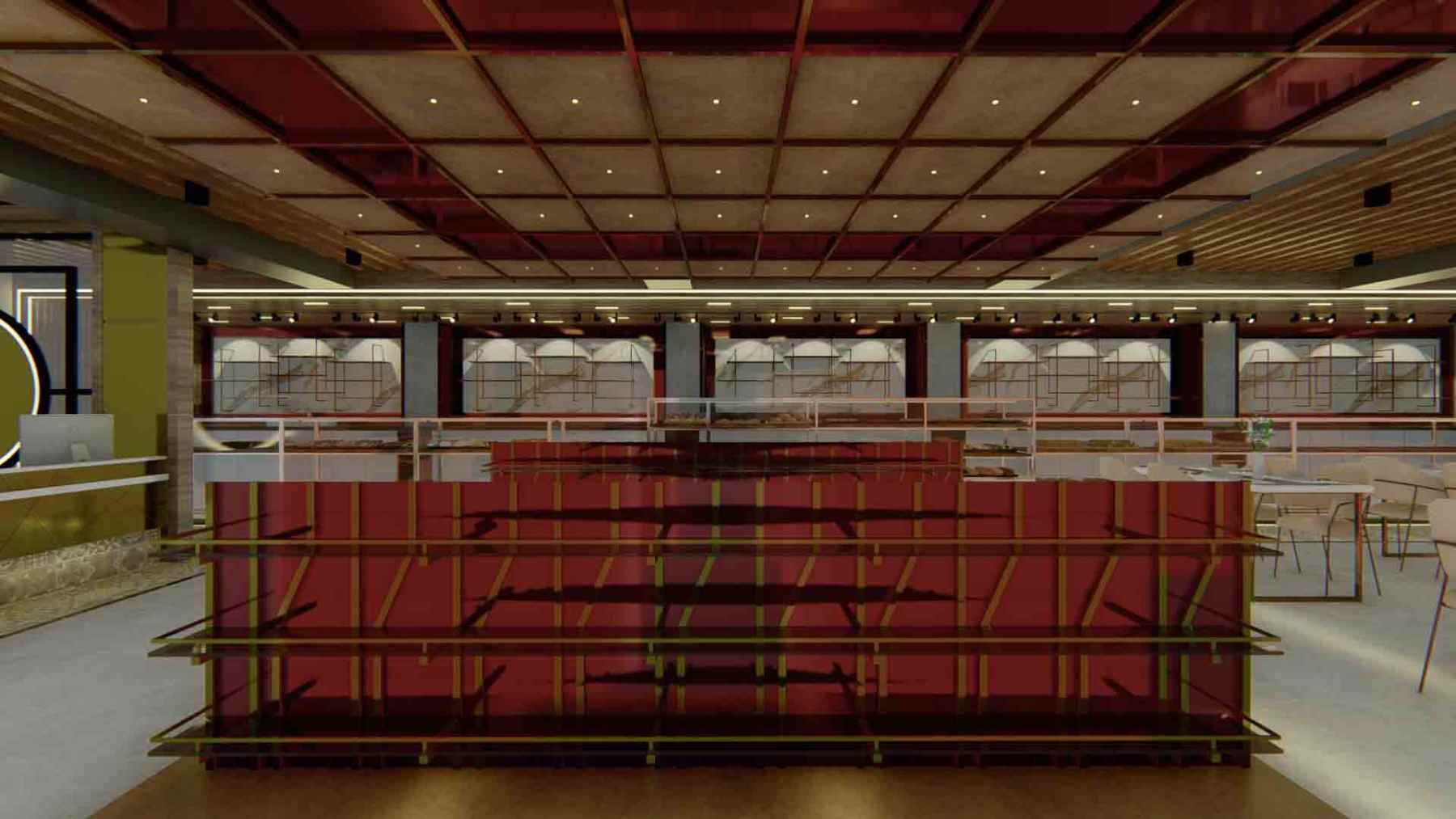
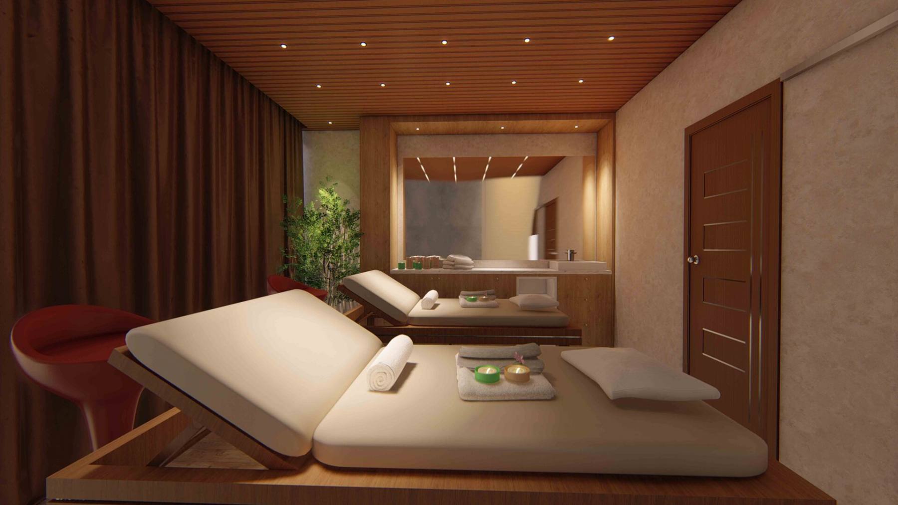
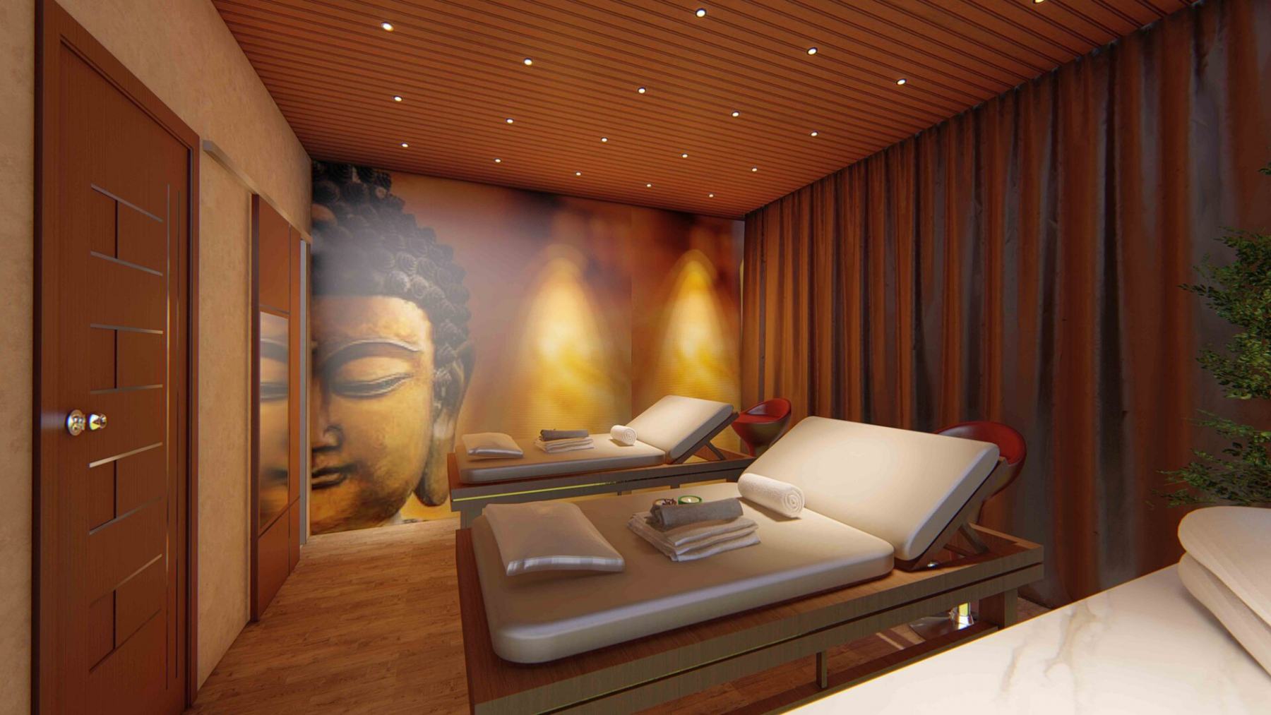
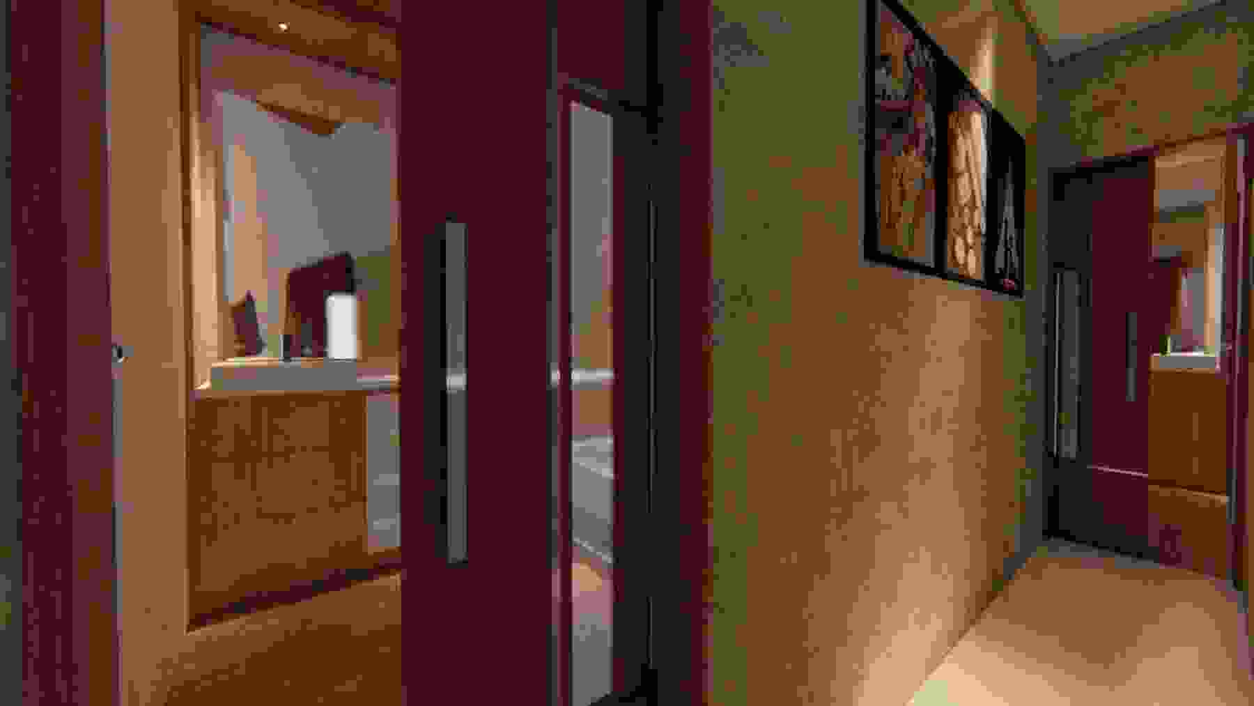
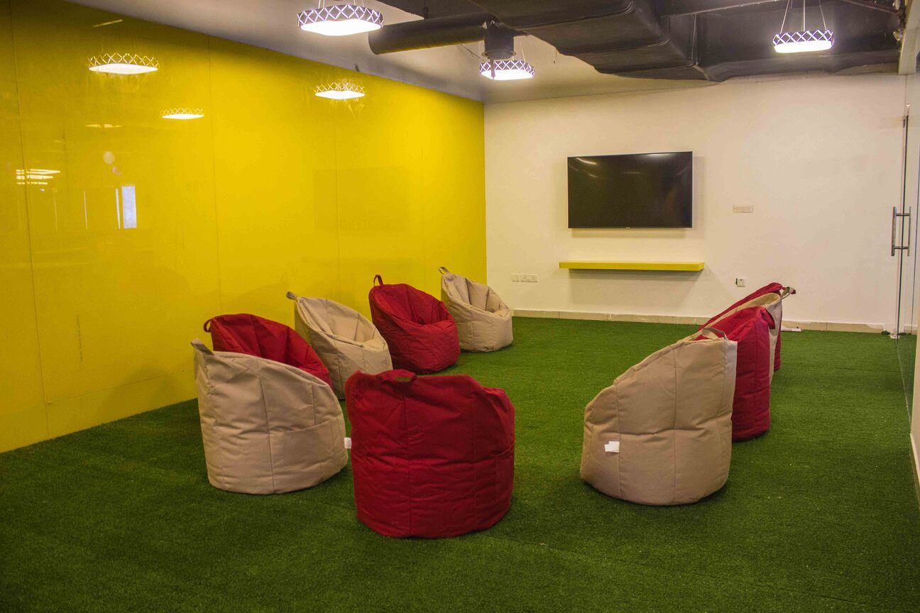
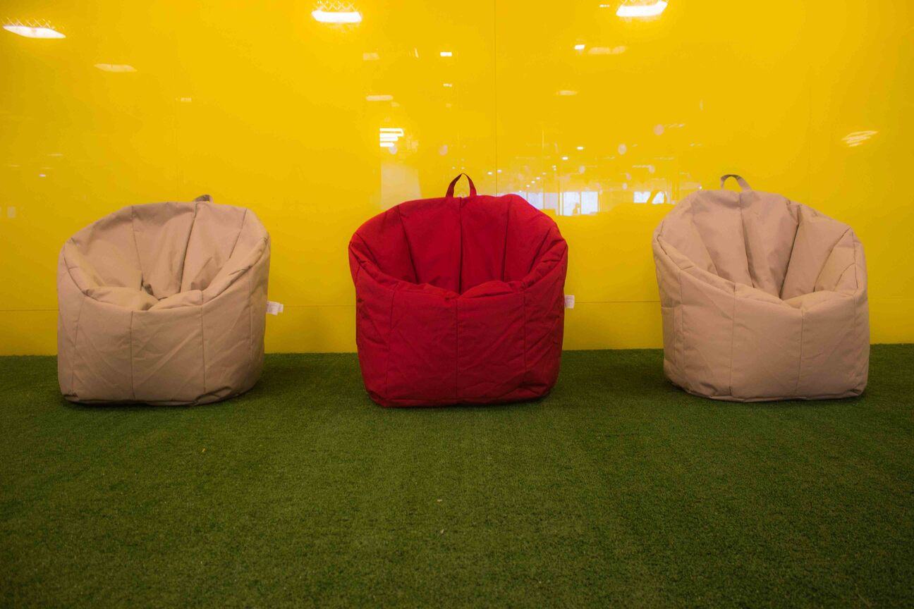
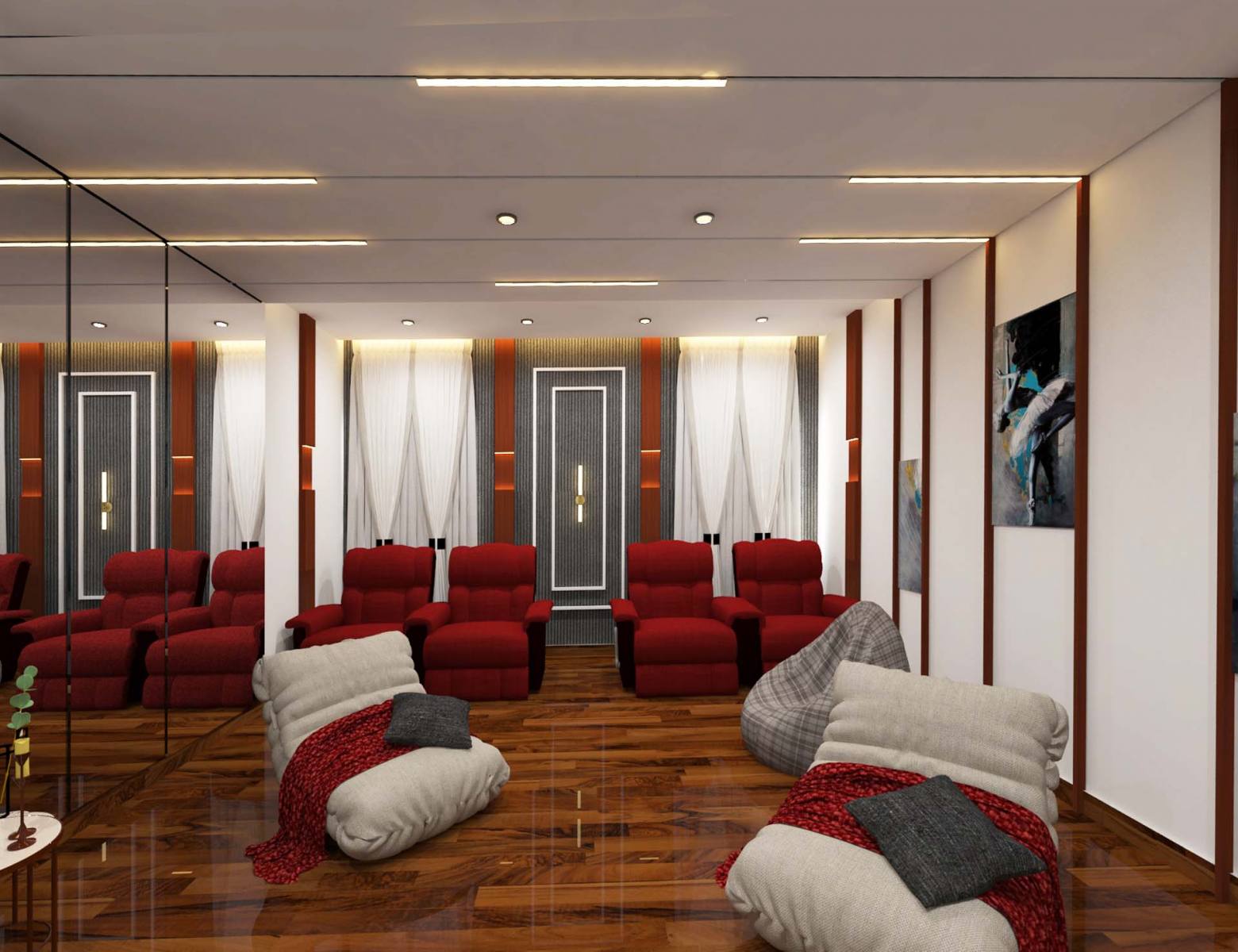
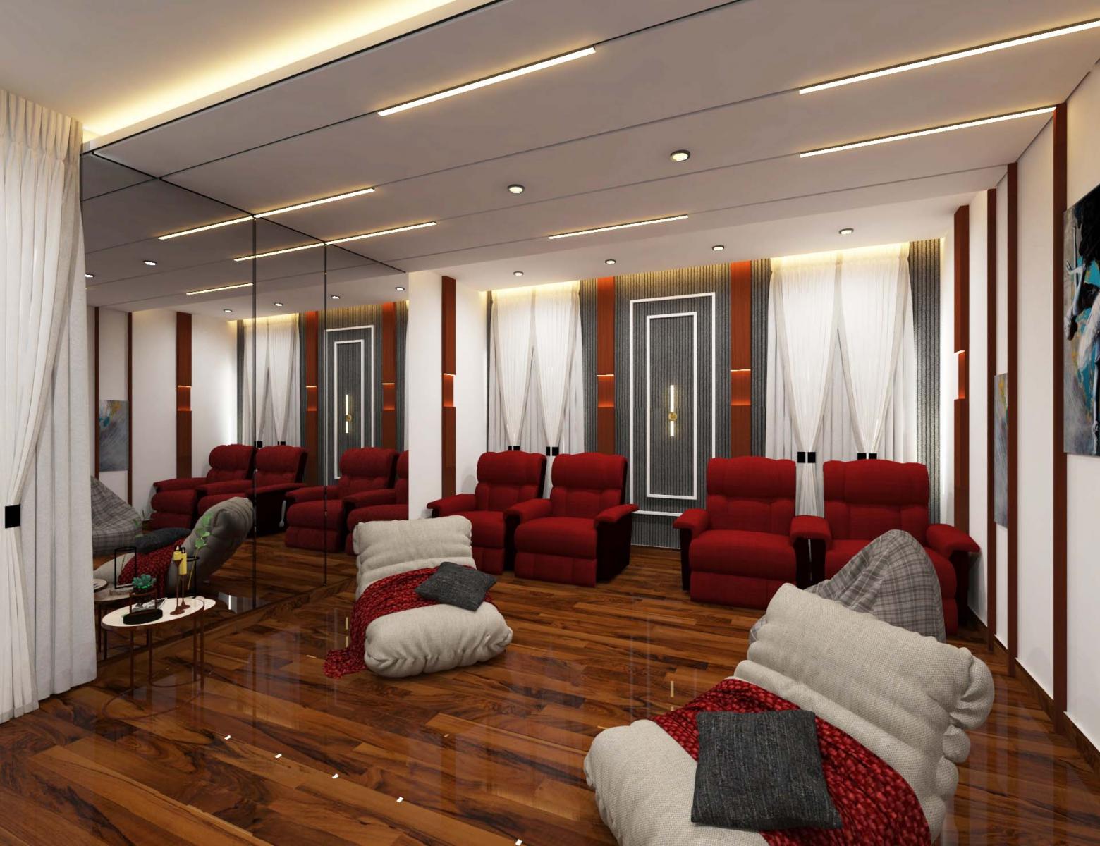
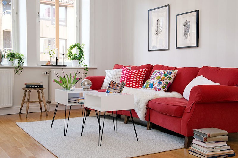
- Red

Red is one of the more dramatic hues in the coloring book and one of the most enticing colors when it comes to rousing emotions. It’s often coupled with sentiments such as passion, excitement and energy. Red is powerful and can convey many different emotions and feelings, depending on its context. Universally, red is a color of strength and we often use it to show power, even dominance. The color is not only powerful in its most basic form in interior design psychology, but also boasts many beautiful shades including tomato red, crimson and burgundy. Whether you want to channel a rich, traditional aesthetic or a pop-art feel, red can provide a solution anywhere-anytime.